
A Reception Space That Needed More Presence
The client was a professional services office in Waterkloof, Pretoria, with a reception area that needed more identity without making the space feel busy. The team wanted visitors to find the front point quickly, then walk into a room that felt ordered, confident and aligned with the rest of the office. Their existing wall surfaces were smooth but plain, and the lighting was good enough to show every detail, so the finish had to be tidy from every angle.
The brief called for interior wall branding and a reception sign that could work in a formal environment. That meant careful colour choices, crisp lettering and materials that would hold their shape in air-conditioned conditions and in Pretoria's dry winter air. We also had to keep the work low-mess because the office remained active during the project. No one wanted dust, glue marks or loose edges in a client-facing space.
- Professional office in Waterkloof, Pretoria
- Interior wall branding for reception and entrance circulation
- Neat appearance suitable for clients and staff
- Low disruption during office hours
Design That Matched The Space, Not Just The Logo
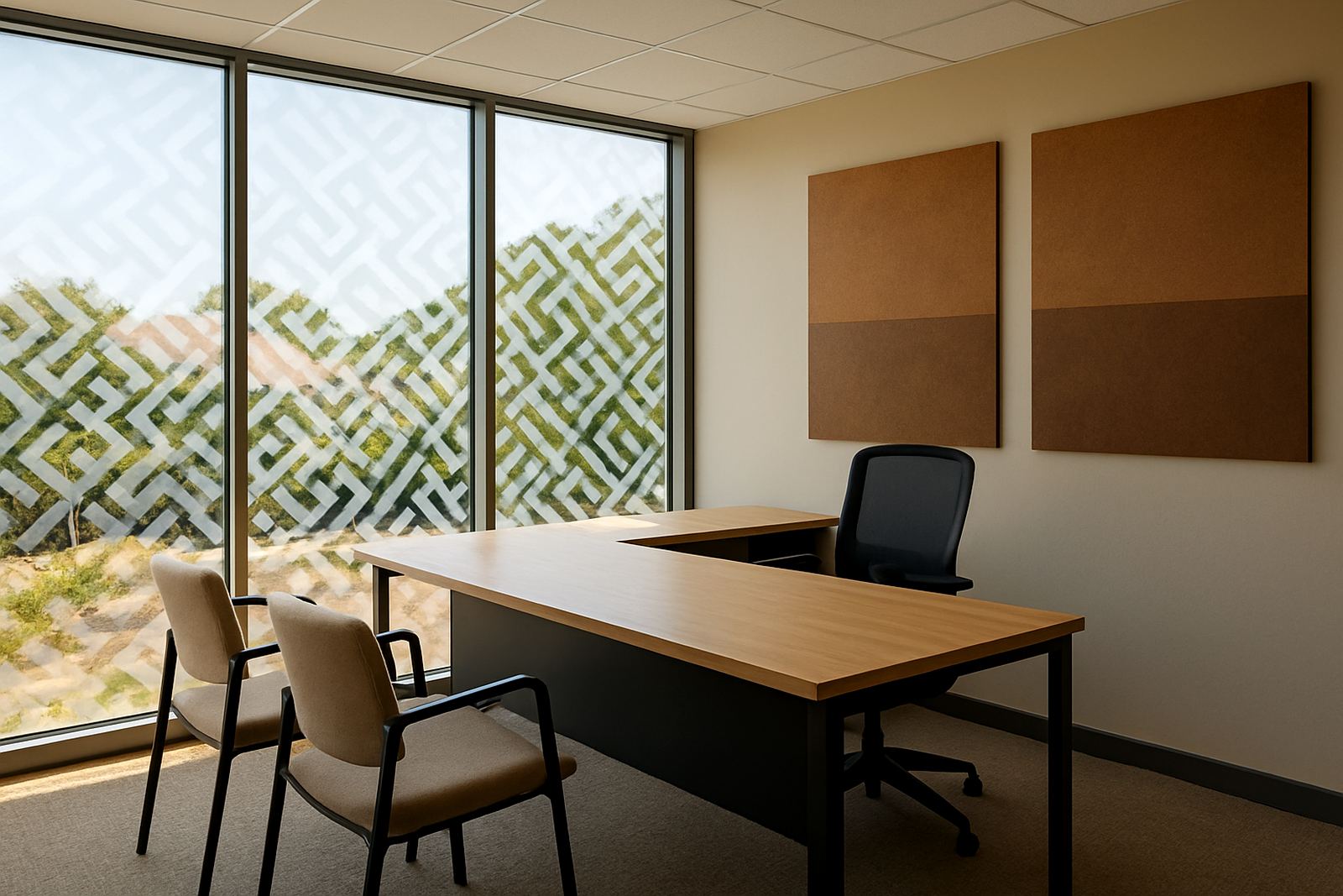
Once we had the measurements and wall photos, Ayanda prepared artwork layouts for the main reception wall and the directional elements around it. The design needed balance. Too little and the wall would still feel empty. Too much and the room would become cluttered. We kept the composition simple, using clear hierarchy, measured spacing and contrast that reads well from a seated and standing position.
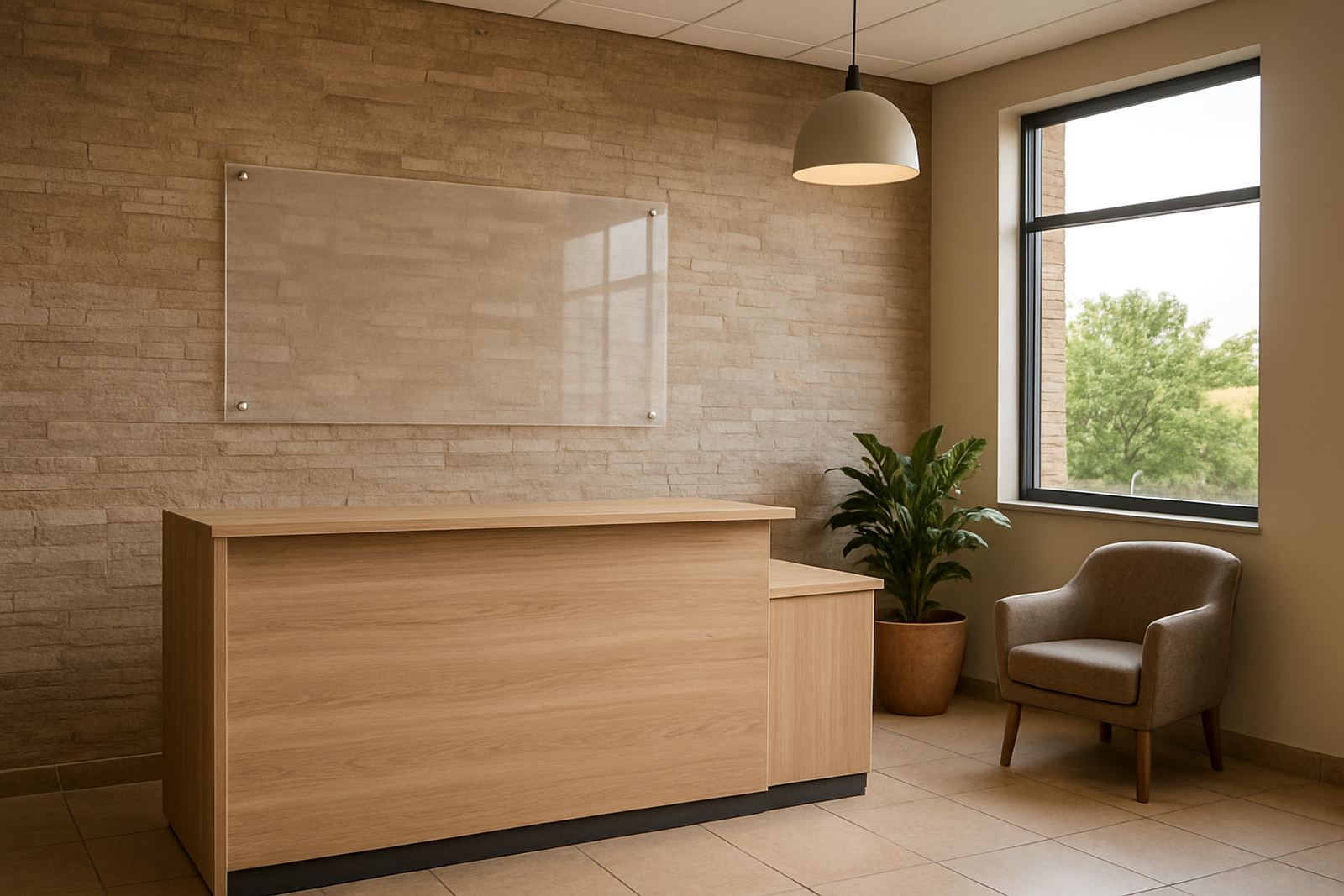
The main reception feature was planned as layered signage with dimensional lettering and a backing panel. That gave the front wall more depth than flat print alone. For the secondary wall branding, we used high-resolution printed graphics with cut vinyl detail where needed. The colour matching was checked against the office tones so the signage felt like part of the interior rather than something added later.
- Artwork set up for viewing distance in a reception area
- Dimensional lettering for depth and shadow line
- Printed elements combined with cut vinyl details
- Colour matched to the surrounding interior finishes
The client approved the visuals quickly because the proposed finish was practical and formal, not decorative for the sake of it. That saved time and allowed production to start without back and forth on minor changes.
Materials Built For A Clean Interior Finish
For the reception signage, we selected materials that would stay flat, hold their edges and clean easily over time. In offices like this, the main concern is not weathering from rain or sun but the daily reality of fingerprints, aircon dust and the occasional scuff from moving furniture. The printed components were produced for sharp indoor viewing and the fabricated elements were finished with a smooth face for a neat result under downlights.
Riaan and Retief handled fabrication in-house, which gave us better control over the cut quality and final fit. The signage was prepared in sections for easier transport and installation on site. Where the wall surface needed extra attention, we did a dry fit first to confirm spacing and level alignment. That reduced the chance of rework once the pieces were on the wall.
Because the office is in Pretoria, we also allowed for the practicalities of building access and working around other tenants. The installation was scheduled to suit the client's hours and to keep the reception usable as much as possible. Lerato coordinated the sequence so the graphics and sign work arrived in the right order, with no waiting around between steps.
- Indoor grade printed panels and cut lettering
- Smooth finish suitable for close viewing in a reception area
- In-house fabrication for better fit and consistency
- Sequenced delivery to reduce site time
Installation In A Live Office Environment
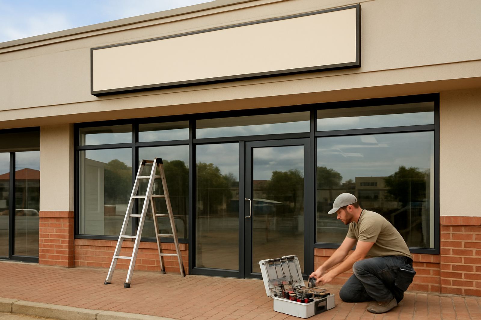
Kagiso led the installation with a small team, which kept the work efficient and controlled. The site had to remain professional throughout, so we planned the process around clean prep, accurate marking and tidy waste removal. The wall areas were measured again on site before fixing, because even a few millimetres out can be obvious on a clean interior wall. With reception branding, the eye goes straight to level lines and spacing, so accuracy matters.
The install took place over a short two-week project timeline from final sign-off to completion. Most of that time was in production and finishing, with the on-site work completed in a much shorter window. That meant the client did not lose days of office use, and the reception area was back in service quickly. Revasha kept the client informed on timing and handover details, so there was no uncertainty about who was coming in and when.
- Two-week timeline from approval to handover
- Measured on site before fixing
- Clean installation with minimal office disruption
- Waste removed and work area left tidy
The final result was a reception area that felt more considered the moment you walked in. The branding gave the office a stronger identity, and the signage now supports both visitors and staff by making the space easier to read.
What Changed After The Signage Went Up
Reception branding does more than fill a blank wall. In this case, it helped the client present a calmer and more organised face to visitors from the first step inside. The visual improvements were immediate, but the practical value showed up too. Guests could orientate themselves faster, the front area looked more polished in meetings and photographs, and the office team had a space that felt finished instead of temporary.
The client also wanted the work to age well, especially with regular use and the steady traffic that comes with a busy office. We chose a layout and material combination that should stay presentable with simple cleaning and normal care. For a space like Waterkloof, where clients expect a professional standard, that kind of detail matters. It is not about flashy graphics. It is about control, consistency and making the right impression every day.
For a similar retail job in Hatfield, we would again measure carefully, keep the design consistent and plan fitting around trading hours.: early site survey, quick artwork turnaround, in-house manufacture and a careful install plan. That process kept the project efficient and gave the client exactly what was needed, without unnecessary extras.
Interior Branding For Pretoria Offices
HM Graphics & Signs works with offices, retailers, brands and municipalities across Tshwane, Centurion, Brits and Gauteng from our Hartbeespoort base. For reception branding, the value is in managing the whole job properly, from measuring and layout to fabrication and fitting. Hendrik Mokoena leads the company with a hands-on approach, and the team includes people who know the difference between a good drawing and a finish that actually works on site.
For Waterkloof, that meant one supplier handling the full chain without handovers between different shops. It is simpler for the client, it reduces mistakes and it keeps the result consistent. If the brief needs permit help, maintenance or later updates, we can assist with that too, but for this project the focus was on a clean interior finish that would hold its own in a formal office setting.
- Site surveys and layout advice
- Graphic design and artwork prep
- Large format printing and sign fabrication
- On-site installation and future maintenance support
Key facts
| Project | Waterkloof Reception Branding |
|---|---|
| Client type | Professional office |
| Town | Waterkloof, Pretoria |
| Timeline | 2 weeks from approval to handover |
| Scope | Interior wall branding and reception signage |
| Services | Site survey, graphic design, fabrication, installation |