
A Clinic Refresh That Had To Work Around Patients
The brief came from a healthcare premises in Pretoria that needed a practical signage refresh for reception, consultation rooms and privacy control on glazed areas. The site had regular patient movement, limited downtime and a strong need for signs that looked tidy, read clearly and held up to daily cleaning.
The team wanted the space to feel more organised without making it look overdone. That meant clean typography, discreet branding and materials that would be easy to keep in good condition. In a medical setting, too much shine or too much visual noise can make a space feel busy, so the plan focused on legibility and restraint.
We started with a site survey to measure the existing wall spaces, door sizes and glass panels. That gave us the layout for the whole package and helped us plan around existing finishes, lighting and foot traffic. The survey also picked up a few small inconsistencies in the walls and frames, which is normal in older premises, and we adjusted the artwork sizes accordingly.
What We Supplied For Reception And Room Identification
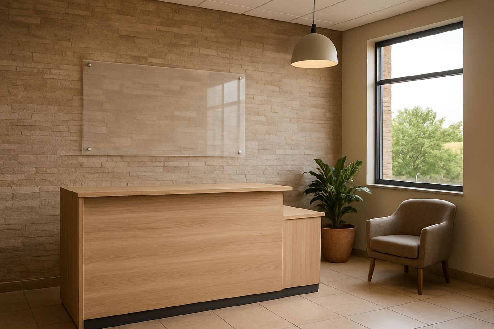
The reception area needed a strong first impression and simple navigation. We supplied dimensional lettering for the main reception wall, room identification signs for consultation and admin areas, and privacy film for selected glass partitions. The finish had to look calm and professional, with enough contrast for easy reading from a distance.
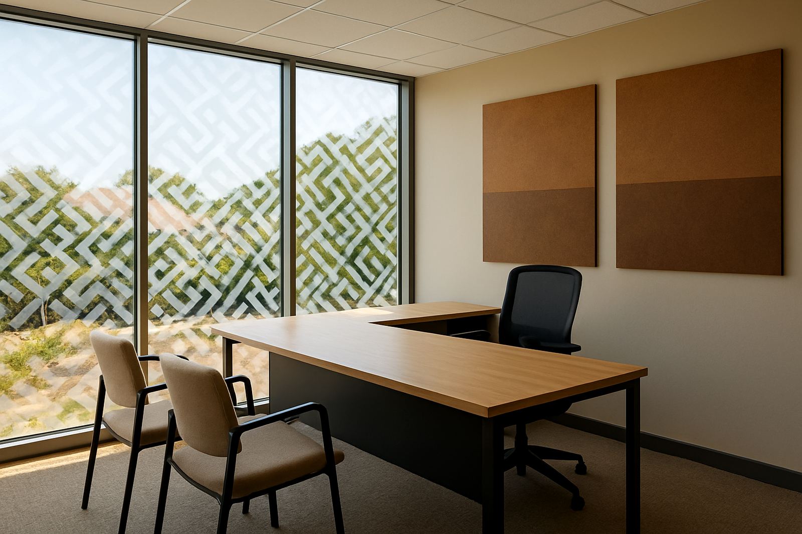
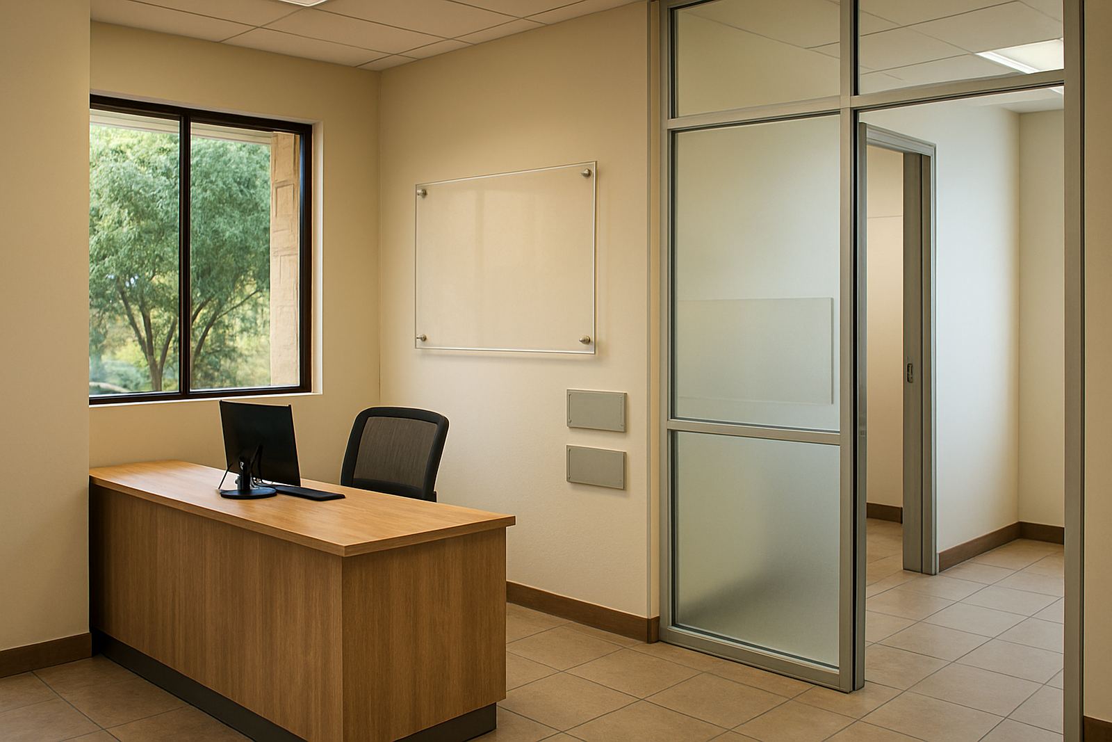
For the room signage, we used clear printed panels with consistent sizing so each door line matched the next. The privacy film reduced visibility into sensitive areas while still allowing light through, which matters in a clinic where natural light is useful but privacy is non-negotiable. On some panes, we used partial frosting with cut vinyl detail to keep the look open and clean.
- Main reception wall branding with dimensional lettering
- Room identification signs for consulting, admin and staff areas
- Privacy film for glass partitions and selected doors
- Cut vinyl lettering for wayfinding and internal labels
- Site-specific sizing to suit existing wall and glass measurements
Materials were selected for indoor healthcare use, where surfaces need regular wiping and the finish must stay neat. The film and graphics were planned for good adhesion on smooth glass and painted wall sections, and we kept the installation layout simple enough to avoid clutter. It was a practical setup, not flashy, but it did the job properly.
Artwork Prep, File Control And Sign Manufacture
Before manufacture, our graphic designer prepared the artwork and checked every sign against the measured site dimensions. That included font sizing, spacing, panel proportion and visual balance from the public waiting area. We also made sure the room names were easy to read at normal walking speed, since that is when most people need to find a door fast.
The production stage covered printing, cutting and finishing in-house. By keeping the work under one roof, we could keep tight control over the details and make changes quickly when needed. The fabrication team prepared the signage components for a consistent finish across all areas, and the production supervisor checked the set before dispatch.
Because this was a live healthcare environment, the job had to be planned carefully around access times. We scheduled the making work first, then arranged installation in a short site window to reduce disruption. The clinic asked for a clean handover and that is what we aimed for, with the final pieces packed in install order so the team could move quickly on site.
- Artwork set up to final size before manufacture
- Consistent typography across all room and reception signs
- Printed and cut components prepared in-house
- Install sequence planned to reduce downtime for staff and patients
Installation In A Working Healthcare Premises
The installation was carried out carefully so the clinic could keep operating during the refresh. Kagiso led the on-site fitting, with the team working in sections to avoid blocking corridors or reception access. This kind of work needs good timing and tidy method, because patients do not need extra noise or mess when they are arriving for appointments.
Glass film was fitted first, then the wall and door signage followed once the surfaces had been cleaned and marked out. The panels were aligned to keep the look straight and consistent from one room to the next. We also checked visibility at a few different walking points to make sure the room names could be read from approach rather than only up close.
Healthcare spaces can be tricky because you are often working around stainless finishes, reflective surfaces and different paint textures. We adjusted a couple of fixing points on site and sorted them there and then, which avoided delays later. The final result was a calm, ordered finish that suited the building and its use.
Timeline, Constraints And What Changed On Site
The full project ran over 3 weeks from initial survey to final installation. Week one covered the site survey and brief confirmation, week two covered artwork prep and manufacture, and week three covered installation and handover. That pace worked well for a healthcare premises that could not afford a long interruption.
The main constraints were privacy, access and cleanliness. The clinic needed the job done without dust, without a messy look and without affecting patient flow. We worked to those limits and kept the install process tight. A few surfaces were not perfectly even, which is fairly common in lived-in buildings, so we made small adjustments during fitting rather than forcing the signs to sit wrong.
- 3 week turnaround from survey to handover
- Work done around patient access and clinic hours
- Minor on-site adjustments made for wall and frame tolerances
- Clean handover with no loose offcuts or visible installation clutter
The result was a better organised space with clearer navigation and more privacy where it was needed. That matters in a clinic, because people notice the details whether they say so or not.
Why This Approach Suited The Site
What worked well here was the balance between utility and finish. The client did not need oversized branding or unnecessary decoration. They needed rooms that could be found quickly, a reception that looked professional and privacy film that supported patient comfort. That simple approach is often the best fit for healthcare spaces in Pretoria and across Gauteng.
If we were to do the same job again, we would follow the same sequence: survey first, artwork after measurements, manufacture in-house, then a carefully timed installation. For sites with active patients or staff, that order keeps surprises to a minimum and gives you better control over the final result. It also makes maintenance easier later on, which is a useful point when signs have to stay legible and clean for years.
The project showed how a measured signage refresh can improve the feel of a clinic without stopping operations. It is not only about putting names on doors. It is about helping people move through the space with less confusion and giving the premises a more organised, professional appearance.
Key facts
| Project type | Healthcare premises signage refresh |
|---|---|
| Location | Pretoria, Gauteng |
| Scope | Reception signs, room identification, privacy film |
| Timeline | 3 weeks from survey to installation |
| Services used | Site survey, graphic design, sign fabrication, sign installation, permit assistance |
| Finish | Indoor clinical-grade signage with low-glare privacy control |