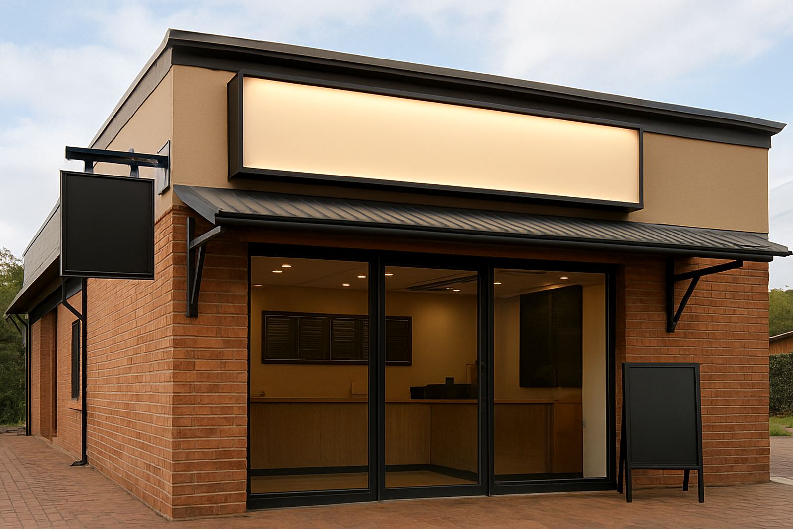
A Clean Food Outlet Look For Lynnwood
This project came from a food retailer in Lynnwood, Pretoria that was fitting out a new customer-facing space in a busy urban centre. The client needed exterior branding that would be easy to read from passing traffic and internal menu boards that stayed clear under mixed lighting, especially during afternoon load-shedding when the dining area relied on backup power and ambient light.
The site had a few practical limits. The frontage was narrow, the glazing area needed to stay open for daylight, and the landlord had rules on fixing points and projection from the façade. We also had to work around final electrical finishing inside the store, so the signage sequence had to be planned carefully to avoid damage to fresh paint and ceilings.
Our approach was to keep the branding crisp and legible. Lynnwood has fast traffic, plenty of short-stay parking and a lot of first-time visitors moving through the area, so the signs had to communicate quickly. No clutter, no complicated shapes, just clear food messaging and a layout that matched the shopfront proportions.
- Location: Lynnwood, Pretoria
- Client type: Food outlet fit-out
- Main requirement: Exterior sign, menu boards and window graphics
Brief, Measurements And Design Direction
We started with an on-site survey to measure the fascia, glass panels and internal wall space. The survey showed that the shopfront could take one primary exterior sign and two supporting window graphic areas without crowding the entrance. We also confirmed the surface condition so the installation team could prep for proper adhesion on the glazing and the wall face.
The brief was simple in principle but strict in execution: make it visible, keep it clean, and make the menu easy to update later. The client wanted branded colour, a professional food-service look and signage that could withstand sun, dust and regular cleaning. In Gauteng, vinyl that is poorly applied can lift at the corners very quickly, so the artwork and material choices had to suit long-term use.
Ayanda prepared the artwork in-house and matched the layout to the site measurements. We kept the typography bold enough to read from the parking area and used a balanced colour block approach so the menu panels did not fight with the window graphics. Revasha coordinated the proofing, while Hendrik signed off the final production plan with the team before manufacture.
- Measured fascia and glazing in millimetres for exact fit
- Prepared artwork for print and cut processes
- Designed for easy future menu changes
What We Manufactured And Installed
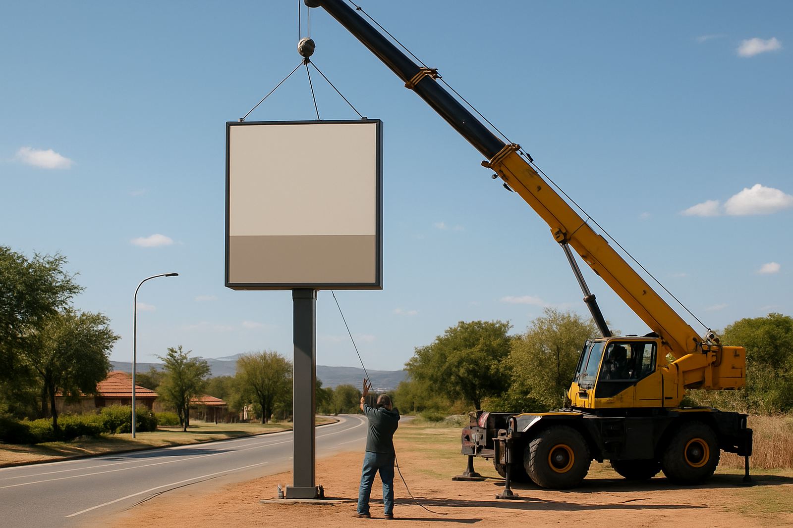
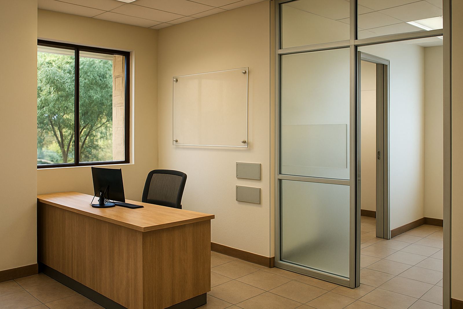
The exterior sign was fabricated as a durable fascia-mounted panel with clean edges and weather-safe finishing. For the windows, we supplied printed and cut vinyl graphics that gave the frontage colour without blocking too much natural light. Inside, the menu boards were produced as clear information panels sized for quick reading at the counter and queue area.
Our production supervisor Riaan oversaw the fabrication workflow, with Retief handling finishing and assembly detail. We used materials suited to Pretoria heat and the occasional dusty wind that comes through the eastern suburbs. For the glazing, the vinyl was applied to allow strong colour while still keeping the interior bright enough for staff and customers. The menu boards were set out for easy content updates, which matters in a food outlet where pricing can change after supplier adjustments.
Kagiso led the installation crew on site. Because the store was in a live retail node, we planned the install to limit disruption to neighbouring tenants and to keep the entrance usable. The final fix was done neatly, with the panels aligned to the shop lines and the glass graphics positioned so they looked intentional from both inside and outside.
- Exterior fascia sign with weather-resistant finish
- Window graphics for branding and privacy balance
- Menu boards sized for fast counter reading
Installation In A Tight Pretoria Timeframe
The full job ran over two weeks from survey to final handover. Week one covered measurement, artwork prep and proof approval. Week two covered fabrication, print production and installation scheduling. This sequence worked well because the client was still finishing internal fittings and we needed enough flexibility to avoid clashes with contractors on site.
Weather also had to be considered. Pretoria summer heat can affect handling of adhesive films, and the team used controlled installation steps to make sure the vinyl seated correctly. We also checked the wall and glass surfaces before fixing, since dust and construction residue can shorten the life of a sign if it is left uncleaned. A few touch-ups were needed on site, but the process stayed on track and the handover was done on time.
For a client opening in a busy part of Lynnwood, the main win was speed without sacrificing finish quality. The frontage was ready for trading as planned, and the store could start welcoming customers with a proper brand presence from day one.
- Timeline: 2 weeks from survey to installation
- Worked around internal fit-out and contractor access
- Installed with minimal interruption to trading area access
Results On The Shopfront And Inside
The finished branding gave the outlet a proper street presence. From the road, the exterior sign now anchors the façade and makes the store easier to spot in a busy retail strip. The window graphics add colour and identity without making the interior feel closed off, which is important for food service spaces that need a welcoming feel.
Inside, the menu boards improved order flow because customers could read the offer more quickly at the counter. That helps staff too, since fewer people have to ask basic menu questions while the queue is moving. The overall effect was a cleaner front-of-house experience that matched the new fit-out and made the space feel complete.
The client also had the advantage of dealing with one team for design, manufacture and installation. That meant fewer delays, fewer handover gaps and one clear point of accountability from the first site visit to the last fix on the glass. It is a practical approach, and in a retail opening every day lost to unfinished branding costs real money.
What We Would Repeat On The Next Food Fit-Out
If we were doing a similar project again, we would follow the same sequence: site survey first, then artwork based on exact measurements, then production with installation dates tied to the fit-out programme. That order keeps the work controlled and helps avoid expensive rework when the joinery or electrical layout shifts late in the process.
We would also continue using a mix of exterior signage, window branding and counter-facing menu boards for food outlets in Pretoria, Centurion and Tshwane areas. It gives the client one consistent look across the shopfront and sales area, and it holds up well in high-traffic locations where signage needs to do real work, not just look nice on paper.
For future projects, we would again pay close attention to maintenance access, surface prep and local permit requirements where applicable. In retail nodes with landlord conditions or municipal sign controls, that early checking saves time later. The result here showed that when the details are handled properly, a modest size outlet can still look well established and easy to trust.
- Use exact measurements before final artwork
- Plan installation around fit-out work and trading access
- Allow for future menu updates and easy maintenance
Key facts
| Project | Lynnwood Restaurant Branding |
|---|---|
| Location | Lynnwood, Pretoria |
| Client type | Food outlet fit-out |
| Scope | Exterior sign, menu boards, window graphics |
| Timeline | 2 weeks |
| Services used | Site survey, graphic design, large format printing, sign fabrication, sign installation |