Why the finish matters more indoors than people think
Reception and office signs are often viewed at close range, so small details matter. A finish that looks good on a computer mock-up can look dull, shiny, or cluttered once it is mounted on a painted wall, glass panel, or timber surface. In offices across Pretoria and Hartbeespoort, signs also need to read cleanly under strip lighting and near windows where glare can be a problem.
The right finish supports the message. A law office may want a clean, restrained look. A retail head office may need something sharper and more branded. Municipal spaces often need signs that are practical, easy to clean, and clear from the first glance. The finish helps set that tone without making the sign shout.
- Gloss can reflect light and make small text harder to read.
- Matt finishes reduce glare and suit most interior spaces.
- Textured or layered finishes add depth for feature signs and reception walls.
Acrylic, PVC and other solid substrates
Many indoor signs start with a solid base. Acrylic is popular for reception signs, directory panels, and room markers because it gives a neat edge and can be cut into custom shapes. It works well when you want a polished look without too much visual weight. In a bright foyer, clear or coloured acrylic with polished edges can look professional and still remain simple.
PVC and similar sheet materials are often used where the budget is tighter or where the sign does not need the same premium feel. They are lighter and easier to mount, which helps on tiled walls and partition systems. For indoor branding in offices that are being reconfigured often, these materials can be practical because they are straightforward to replace or update.
- Acrylic suits reception signs, office numbering and branded wall features.
- PVC suits short term promotions, internal directions and lighter duty panels.
- Thicker boards can help when a sign needs more depth and presence.
Vinyl print, cut lettering and layered graphics
For many indoor applications, the finish is created by the graphic face rather than the base material alone. Printed vinyl gives full colour, gradients and photographic detail, while cut vinyl lettering offers a crisp look for names, room labels and directional arrows. When applied well, both can look tidy and last well indoors. The key is matching the material to the wall colour and lighting conditions.
Layered graphics are often overlooked. A printed panel with cut vinyl over it can create a sign that reads from a distance yet still has detail up close. This works well for shared buildings, clinics, school offices and municipal service points where visitors need clear guidance. It also helps when there are several departments on one wall and each one needs its own identity.
- Cut vinyl is neat for names, arrows and simple wording.
- Printed vinyl is better for colour-heavy branding and images.
- Layering can improve visibility without making the sign too busy.
Matt, satin or gloss: choosing the right sheen
Sheen affects readability more than many clients expect. Matt finishes are usually safest for indoor wayfinding because they minimise reflection from overhead lights and windows. Satin gives a softer low shine and can work well for corporate reception signs where a little depth is wanted. Gloss is best used carefully, usually on smaller feature pieces or where the lighting is controlled.
In offices with open-plan layouts, mixed lighting can create patchy reflections on shiny surfaces. In a Pretoria reception area with large glass frontage, a gloss sign may look attractive in one spot and difficult to read in another. For that reason, many indoor signs work better with a matt or satin finish, especially where people must read them quickly while walking past.
A practical rule is simple. If the sign carries important information, keep the sheen low. If the sign is mostly decorative and viewed from one angle, a higher sheen can be considered.
Raised letters, brushed effects and textured detail
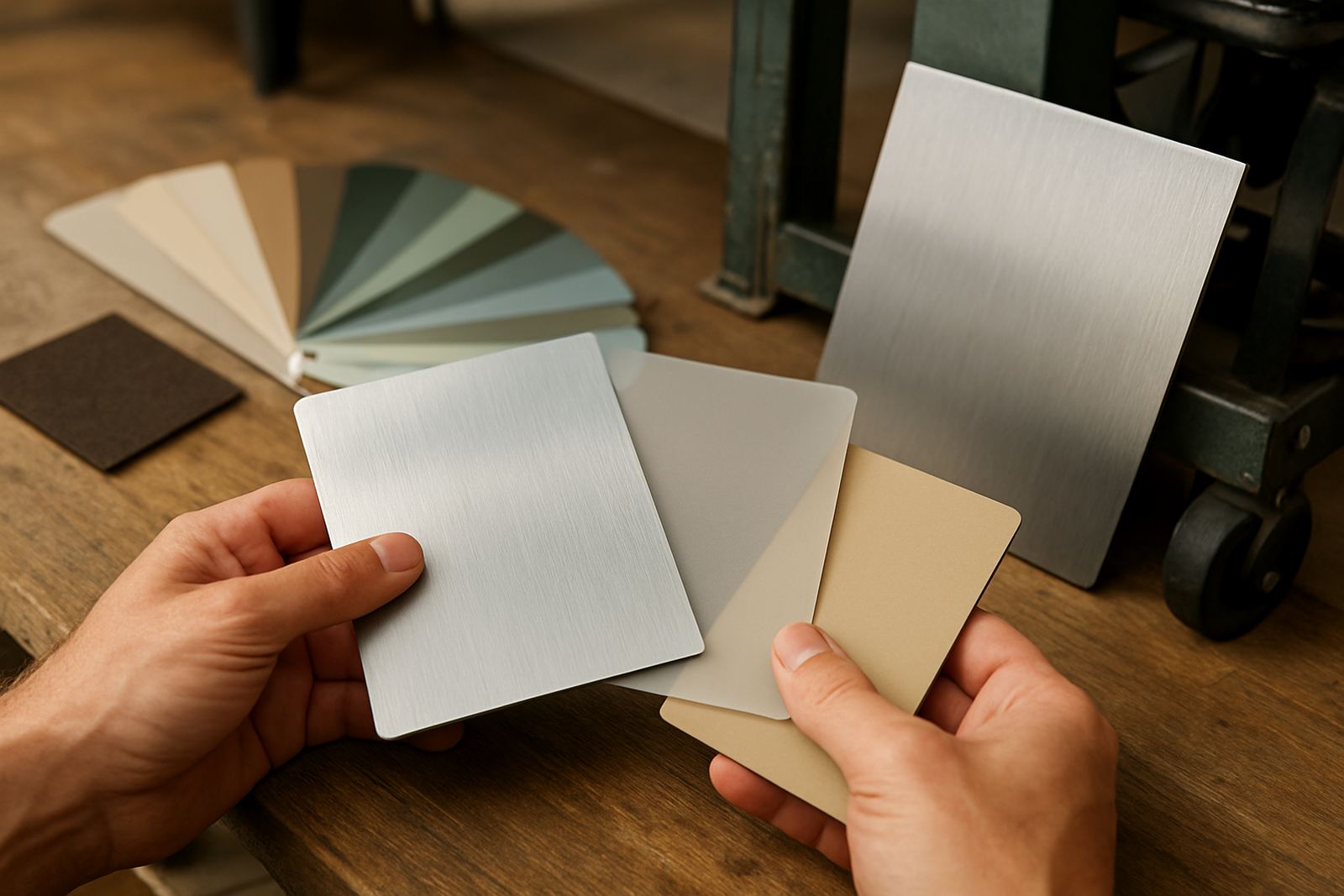
Some indoor signs need presence. Raised letters, brushed metal effects, and textured backgrounds give a reception area more depth without making it heavy. These finishes suit law firms, medical practices, estate offices, and corporate spaces that want a more refined look. They also work well in buildings where the interior walls are plain and the sign must carry the visual weight.
Textured finishes can hide small marks and make the sign easier to keep looking clean. This is useful in busy areas where fingerprints, dust and occasional scuffs are part of daily use. In coastal Gauteng surroundings and warm interior conditions, a finish that is easy to wipe down can save maintenance time.
- Raised lettering helps a sign stand out on a plain wall.
- Brushed effects add detail without looking flashy.
- Textured backing can make maintenance simpler over time.
Practical choices for wayfinding in offices and shared buildings
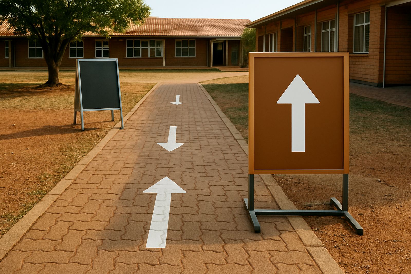
Wayfinding signs must do one job well: guide people quickly. That means the finish should support legibility above all else. Directional boards, door markers, floor identifiers and meeting room signs all need consistent colour use, strong contrast and a surface that stays readable under changing light. In a building with tenants coming and going, it also helps if the finish is easy to update when room names change.
For office blocks in Centurion, Pretoria and Tshwane, a good wayfinding finish is often a matt printed panel with clear icons, paired with cut lettering where needed. In shared buildings, numbering and department labels should be fixed with durable interior mounting so they sit straight and stay secure. If the sign is likely to be changed often, choose a finish that allows easy replacement instead of trying to make each board permanent.
- High contrast improves visibility for visitors and staff.
- Consistent finishes help the whole building feel organised.
- Modular panels are useful where names and rooms change often.
A local example from Hartbeespoort to Pretoria
A reception upgrade for a Pretoria office can be a good example. The client wants the front counter to feel calmer, the corridor signs to be clear, and the meeting room labels to match the brand. The wall at reception may take a brushed effect with raised lettering, while the corridor uses matt printed wayfinding panels. The meeting room signs can stay simple with cut vinyl on acrylic so they are easy to read from a short distance.
This kind of mix works well because not every sign has to carry the same finish. A single building can have feature signs, practical signs and compliance-related signs all working together. At HM Graphics & Signs, the process usually starts with a site survey, then artwork prep, production and installation so the finishes suit the wall, the lighting and the daily use of the space.
That practical approach matters whether the job is in Hartbeespoort, Akasia, Rosslyn, Soshanguve, Brits or central Pretoria. Indoor signs should look good on day one and still make sense when staff, visitors and suppliers move through the building every day.