Why public buildings need more than one sign type
Public buildings deal with a constant flow of people, from regular visitors to first time users who may not know where to go. A single sign at the gate is never enough. You need a signage plan that guides people from the street to reception, then through corridors, counters, waiting areas and exits.
In facilities such as municipal offices, clinics and community halls, the aim is not decoration. It is clarity. A person must be able to spot the entrance, understand which queue to join, find the right department and leave the building safely if there is an emergency. Good signage also reduces pressure on staff because fewer people need to ask for directions.
For buildings in Pretoria, Brits and Tshwane, we often see the same problem: signs are added one at a time over the years and they do not match. Fonts differ, colours clash, and some signs are too small for older visitors or people standing at a distance. A planned signage system keeps everything consistent and easier to read.
Signage that helps visitors move through the site
Wayfinding signs are the backbone of any public facility. They should be placed at decision points where people have to choose a direction, such as entrances, lifts, stairwells, passage junctions and service counters. If a visitor has to stop and think, the sign is either in the wrong place or not clear enough.
Useful wayfinding signage usually includes:
- Directional signs to reception, toilets, exits and departments
- Door signs for offices, meeting rooms and service points
- Floor or wall panels showing the building layout
- Queue control signs for waiting areas and collection points
- Accessible signs with clear symbols and readable lettering
For larger sites in Centurion or Rosslyn, signage must work from a distance and under different lighting conditions. We recommend durable materials that hold up well in strong sun, dust and regular cleaning. In busy public spaces, the finish also matters because glare can make a sign difficult to read.
Safety, compliance and emergency direction
Public buildings must guide people safely, especially during load-shedding, power outages or after-hours use when visibility is lower. Emergency exits, fire equipment, muster points and restricted areas all need clear identification. This is not an area to guess at, because unclear safety signage can put people at risk.
We usually advise a mix of illuminated, reflective or high-contrast signs where required, along with clear directional panels to exits and assembly points. Stairwells, generator rooms, plant areas and electrical cupboards should be marked properly too. In facilities with public access, the signs need to stay readable even after repeated cleaning and handling.
Where municipal rules or site-specific compliance requirements apply, signage should be checked before installation. That includes height, placement, wording and whether the sign can be seen from the intended approach route. A clinic in Akasia will have different circulation needs from a licensing office in Pretoria CBD, so one standard layout does not always fit every site.
Materials suited to South African weather and public use
Public facility signs are exposed to a lot: heat, dust, moisture, cleaning chemicals and constant touch. In Hartbeespoort and other humid areas close to water, corrosion can become a problem if the wrong material is used. In busy Gauteng sites, vandalism and wear are also real concerns.
We select materials based on where the sign will live and how often it will be used. For example, indoor directional signs can be made with printed panels, cut vinyl or laminated boards, while outdoor building identification may need stronger framing, better fixing and weather resistant finishes. Aluminium composite, acrylic, PVC and steel each have a place depending on the job.
Our approach is to match the material to the environment rather than forcing one solution everywhere. That keeps maintenance down and helps the signage last longer, which matters for public budgets that need to stretch. If a sign is installed properly from the start, it usually needs fewer callouts later.
How we handle design, production and installation
At HM Graphics & Signs, the process starts with a site survey. We look at entrances, sight lines, wall space, fixing points and the daily flow of people. From there, our graphic design team prepares the artwork and wording so that signs are consistent across the site. If the building has multiple users or departments, we can help organise the content into a clear hierarchy.
Our in-house production team manufactures the signs and our installation crew fits them on site. That matters because public facility signage often has tight time frames and limited access windows. A library, clinic or municipal office may only allow work after hours or over a weekend, so planning is important. We also assist with permit related requirements where needed, especially for external branding or signs visible from public roads.
Team members such as Lerato Mthembu, Riaan Odendaal, Ayanda Mavuso, Kagiso Ndlovu, Revasha Desai and Retief Wessels each handle their part of the process, which keeps communication tight from first brief to final fitment. Hendrik Mokoena oversees the business with a practical focus on workmanship and site readiness.
- Site surveys before manufacture
- Artwork prep for clear, readable layouts
- Large format printing and vinyl cutting
- Fabrication for indoor and outdoor signs
- On-site installation across Tshwane and Gauteng
A local example: public signage for a busy service point
Consider a municipal service centre in Pretoria that serves residents from Soshanguve, Akasia and surrounding areas. People arrive early, often in groups, and many need to find different counters for payments, enquiries or document collection. If the entrance is not marked clearly, the queue is not separated properly and the departments are not labelled well, the whole site slows down.
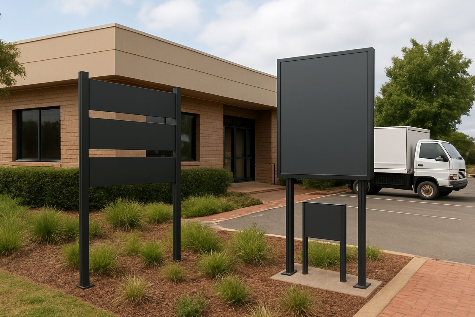
A good signage package for this kind of facility may include an external building sign, entrance direction, parking and pedestrian guidance, queue number boards, counter labels, toilet signs and emergency exit markers. If there is a separate area for staff or restricted access, that should also be marked so visitors do not wander into the wrong space.
We have found that simple, direct wording works best. Public signs should avoid long sentences. They must be readable at a glance, with enough contrast and size for the distance at which people see them. That is especially important in high traffic areas where people are moving quickly and may only have a few seconds to read the message.
Keeping signs working after installation
Signs in public spaces need upkeep. Sun exposure fades colours over time, fasteners loosen, and cleaning can wear down printed surfaces. In some buildings, departments change names or layouts shift after renovations, which means the signage needs updating too. Regular maintenance is cheaper than replacing a whole sign system later.
For facilities that run year round, we can assist with sign maintenance and refurbishment. That might mean replacing damaged panels, refreshing faded graphics, updating department names or adding new directional signs after a layout change. If the site expands, we can match the existing system so the new signs look like they belong.
Public facility signs should do their job quietly and well. When visitors can find what they need without asking twice, the building feels more organised and staff can get on with the work that matters.