
Start with the first thing visitors see
Reception branding works best when it answers three simple questions straight away: who are you, where should visitors go, and what kind of business are you running. A clean wall logo, a clear reception sign and readable directional signs can do that without crowding the space. In offices around Tshwane and Centurion, where visitors may arrive in a hurry or after driving through traffic, clarity matters more than decoration.
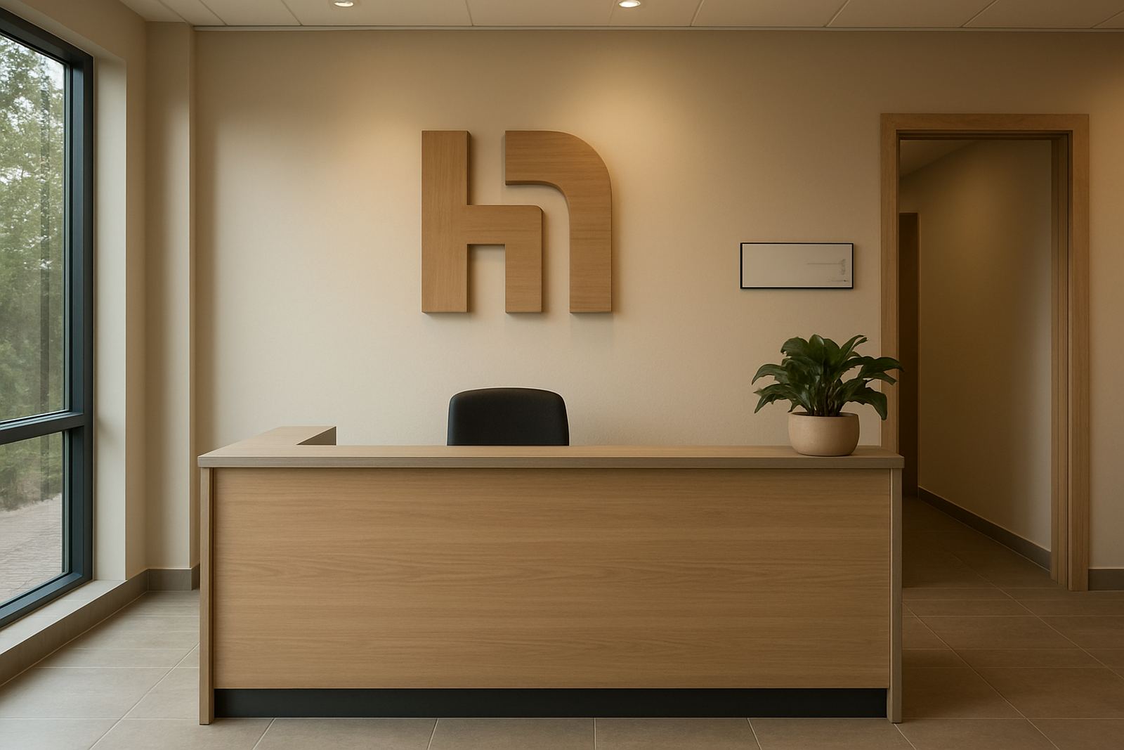
Think about the view from the doorway. If the counter blocks the logo or the branding sits too high, the space loses impact. The main sign should be placed where it can be seen on arrival, ideally with enough contrast against the wall colour. On darker feature walls, white or light-coloured lettering usually reads better, while on pale walls a darker finish gives stronger definition.
- Keep the main logo large enough to read from the entrance.
- Match the sign position to the natural line of sight.
- Leave space around the sign so it does not feel crowded.
Use wall features that make the space feel settled
Interior wall features can change the feel of a reception area without major building work. A layered logo, cut lettering or a framed graphic panel adds depth and helps the area feel considered. For businesses that receive contractors, municipal visitors or retail clients, this kind of finish gives the impression that systems are in place and details are handled.
Material choice matters too. In air-conditioned offices, most interior finishes perform well, but in reception areas near doors or windows, direct sun can fade poor-quality graphics over time. In places like Pretoria East and Hartbeespoort, where bright light can hit a foyer most of the day, it is worth planning for glare and heat. Matte finishes often reduce reflection, especially when the sign sits opposite a glass entrance.
- Use layered lettering for a more formal look.
- Choose finishes that suit the wall texture and light levels.
- Allow for cleaning access around the sign area.
Make directions easy for visitors and couriers
A reception area should do more than look good. It should guide people without making them ask basic questions at the counter. Simple directional signs for waiting areas, toilets, security access or meeting rooms make a big difference, especially in multi-tenant buildings or municipal offices where visitors may be unfamiliar with the layout. A clear sign saves time for staff and reduces confusion at peak periods.
Where visitors need to sign in, wait for approval or collect parcels, the route should be obvious from the entrance. A small arrow panel or wall-mounted directory can work better than a long explanation from staff. For sites with restricted access, signage should also support site rules, visitor registration and health and safety notices. That helps the reception area feel orderly, not cluttered.
- Place directional signs where people naturally pause.
- Use short wording and simple arrows.
- Keep visitor instructions visible but not overpowering.
Brand the counter without overloading it
The reception counter is often the busiest point in the room, so it needs practical branding that does not get in the way. A modest logo panel on the front of the counter, a printed graphic wrap on the side, or a slim illuminated feature can add identity without taking away working space. If the counter is used for forms, parcels or visitor cards, the finish should be durable and easy to wipe down.
For customer-facing businesses, the counter is also a photo point. People often take pictures of branding in entrance areas, especially at launches or events. A neat counter sign can help a company appear consistent in those images. Keep the wording brief and the front panel neatly finished. Too much copy on a front panel can look busy and make the reception area feel cramped.
- Use the counter as a support feature, not the main sign.
- Choose materials that handle regular cleaning.
- Keep the branded area clear of loose items and paperwork.
Add local touches that make the brand feel familiar
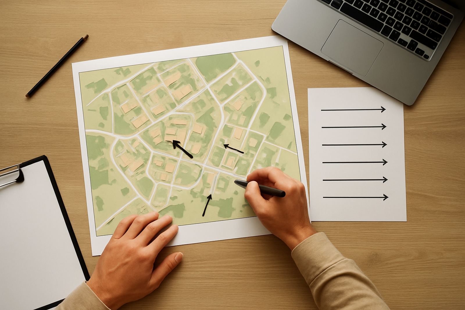
Reception branding should reflect the business and the area it serves. A company operating in Pretoria, Brits and Hartbeespoort may want the same core identity across all branches, but each space can still carry a small local note. This could be a township reference, a subtle map graphic or a regional service list that reminds visitors they are dealing with a team that knows the area.
For example, a client office in Rosslyn that welcomes suppliers daily may benefit from bold directional signs and a simple service board. A reception in Centurion that hosts brand meetings may need a cleaner, more corporate look with fewer visual elements. The point is not to fill the wall, it is to choose details that suit the people using the space.
Local climate matters too. In some offices near open entrances, dust and moisture can collect faster than expected, especially where there is high foot traffic or coastal humidity reaches inland installations through seasonal weather patterns. Finishes that clean easily and hold up well against marks are worth the extra planning.
- Use one or two local references, not too many.
- Match the reception style to the type of visitor.
- Choose finishes that stay neat in busy areas.
Plan the installation so the finished space stays practical
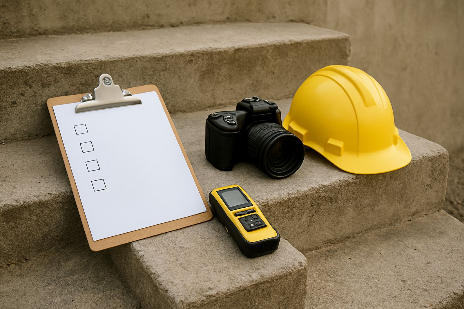
Good reception branding is not only about graphics, it is also about site planning. Measurements, wall condition, lighting and fixing points all affect the result. Before installation, the wall should be checked for uneven paint, weak plaster or moisture marks that could spoil the appearance later. If the reception is in an older building, this step becomes even more important.
For businesses that need signage across multiple sites, the best approach is to create a repeatable system. That might include a standard logo wall, directional panels, permit checks for building rules where required, and maintenance planning for signs that may be moved or updated during campaign rollouts. A reception area should remain easy to update when staff names, service areas or compliance notices change.
- Measure the wall and sight lines before manufacture.
- Check the wall finish and fixing surface first.
- Allow for future updates without redoing the whole area.