
Start with the sign people see from the road
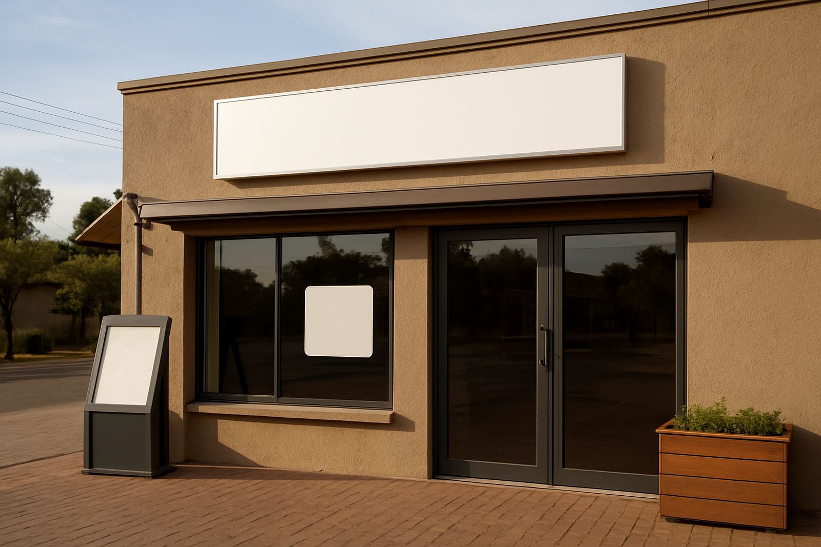
The first priority for any restaurant is the frontage sign. If a driver in Pretoria or a family heading through Hartbeespoort cannot read your name quickly, they may miss the turn or simply keep going. A good front sign should be visible from the right distance, sized for the speed of the road, and lit well enough to work after dark and during load shedding.
At HM Graphics & Signs, we often find that restaurants need to think beyond one panel on the wall. Corner sites, shopping centre units and roadside stops all ask for different treatments. A highway-facing site may need a larger box sign or raised letters, while a courtyard restaurant may need cleaner branding on a fascia, blade sign or entrance feature. The aim is simple: make the brand easy to spot, then easy to remember.
- Choose high contrast colours for quick reading.
- Keep the name and logo clear, not crowded by too many details.
- Allow for night visibility with proper lighting or reflective detail.
- Check that the sign fits the landlord or municipal rules before fabrication.
Menus must be readable before the customer reaches the counter
Menu boards are often treated as decoration, but they do a lot of heavy lifting. They decide speed of service, help with upselling and reduce confusion at the till. In busy lunch periods, a clear menu can save staff time and help customers order faster, which matters in places like Centurion and Tshwane where lunch traffic moves quickly.
Printed menus should have good contrast, enough spacing and a sensible hierarchy. Specials can be highlighted without making the whole board noisy. If a menu changes often, plan for panels or inserts that can be updated without redoing the full structure. For restaurants with indoor and outdoor seating, it can also help to use directional menu repeats so that people queuing outside can make choices before they step in.
- Use larger type for best sellers and meal categories.
- Separate breakfast, lunch and drinks into clear sections.
- Keep prices easy to scan from 1 to 2 metres away, not just up close.
- Allow room for future menu changes and seasonal items.
In the Hartbeespoort area, where weekend visitors often arrive in groups, a legible menu board can reduce waiting time and improve the whole experience. It sounds small, but it changes how the queue feels.
Directional signs shape the customer journey inside and out
Once the customer has found you, the next sign job is to guide them. Directional signage covers parking, entrances, takeaway collection points, toilets, smoking areas and delivery access. Restaurants often overlook this, then wonder why guests walk in the wrong door or queue in the wrong place.
Good wayfinding is especially useful where there are shared parking areas or multi-tenant centres. A simple arrow, mounted at the right height, can prevent frustration. It also supports staff efficiency because deliveries, suppliers and customers are all sent where they need to go without extra explanation.
For restaurants with outdoor seating, signs should handle wind, rain and sun fade. Along the north-facing walls common around Gauteng, colour can bleach faster than expected. Materials and mounting methods need to take that into account, especially if the site is exposed.
- Mark entry, exit, pickup and delivery points clearly.
- Use consistent arrow styles so people do not hesitate.
- Place signs at eye level where possible, and higher where vehicles need to see them.
- Choose durable materials for exposed areas and coastal or high humidity conditions.
Branding should match the kind of restaurant you run
A fine dining room, a family grill and a quick service takeaway do not need the same sign language. A restaurant sign should reflect the pace and price point of the business. If the food is casual and fast, the signage can be bold and direct. If the experience is more refined, the finish must be cleaner and more restrained.
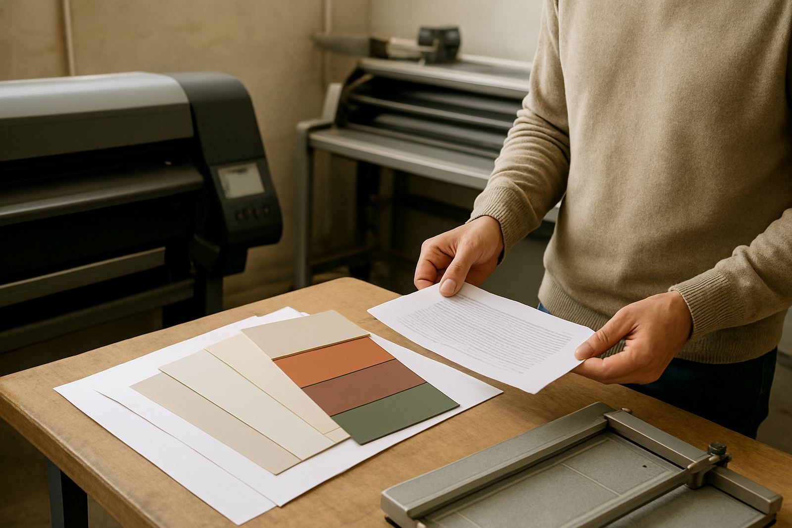
This is where concept and graphic design matter. Colours, fonts, materials and lighting all tell customers something before they taste the food. For example, a Pretoria bistro may want a softer entrance sign with warm internal illumination, while a busy roadside chicken outlet may need larger lettering, stronger contrast and simple window graphics that are easy to read from passing traffic.
Our team led by Hendrik Mokoena works with restaurant owners to get the balance right. Lerato Mthembu handles operations planning, Ayanda Mavuso prepares the artwork, Riaan Odendaal supervises production, Retief Wessels manages fabrication, and Kagiso Ndlovu leads installation on site. That coordination helps the final result match the idea on paper, not just in theory.
Materials and installation decide how long the sign lasts
Restaurants face a rough mix of conditions: steam from kitchens, grease near vents, sun on street-facing walls, and sometimes municipal pressure on where signs may go. That is why material choice matters. Vinyl graphics, fabricated letters, illuminated panels and printed boards all behave differently over time. The best option depends on where the sign sits, how often it needs cleaning and whether it is indoors or outdoors.
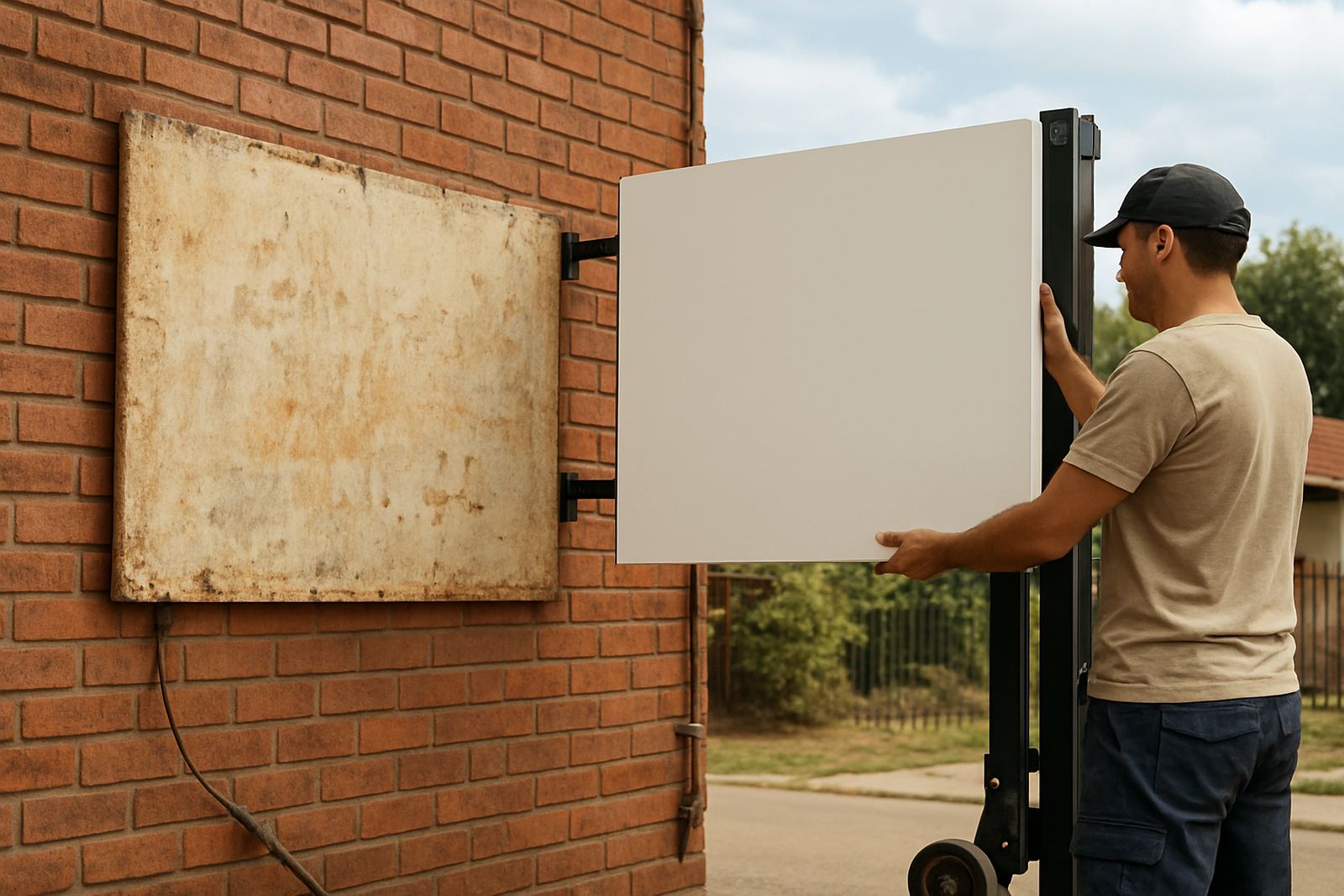
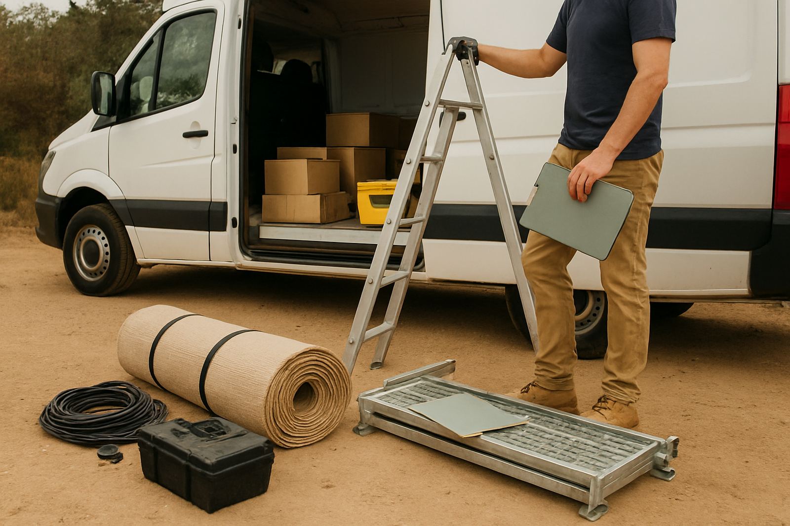
Installation is just as important as fabrication. A sign that is level, securely fixed and sealed properly will hold up better through heavy rain and temperature swings. For storefronts in Brits, Akasia and Rosslyn, we also consider dust and industrial surroundings. At some sites, maintenance access is a practical issue too. If a panel is mounted too high or over a busy doorway, future cleaning and replacement become difficult.
When we handle restaurant projects from our Hartbeespoort base serving Pretoria and surrounding areas, we plan the work around trading hours where possible. That means less disruption to customers and staff, and a cleaner handover at the end.
Rollouts, permits and maintenance keep the brand consistent
Single-site restaurants need one good sign plan. Multi-site groups need a repeatable system. Campaign rollouts across Tshwane, Centurion and Gauteng should use the same measurements, colour references and mounting rules so every branch looks like part of one brand. This is especially important when a restaurant adds specials, new menu boards or seasonal graphics across several locations at once.
Permit assistance can save time too. Some sites need approval for size, position or illumination, and it is better to sort that early than redo work later. Maintenance should not be an afterthought either. Dusty panels, faded vinyl and broken lighting send the wrong message, particularly in hospitality where customers notice the details straight away.
- Set a standard sign pack for all branches.
- Keep spare panels or print files ready for fast updates.
- Schedule inspections after storms, power interruptions and major trade periods.
- Refresh faded menus before they become hard to read.
For restaurants, signage is not only about being seen. It is about helping people feel confident from the road to the table. When the frontage, menus and directional details all work together, the whole visit feels easier.