
Decide what the glass needs to achieve first
Before any film is cut or printed, decide what the glazing must achieve. Is it meant to add privacy, guide visitors, show trading hours, promote a campaign, or simply make a plain frontage look more considered? The answer affects the amount of coverage, the type of vinyl and how much light must still pass through.
For retail in Centurion or offices in Pretoria East, the wrong choice can quickly look heavy and cluttered. In a hot, sunny spot you may need more glare control, while a council office or clinic may need clear sightlines for safety and public access. A good glass treatment should support the building, not fight it.
- Define the main purpose first: privacy, branding, wayfinding or promotion.
- Check how much natural light the room needs through the day.
- Think about the view from outside and from inside.
- Allow for future changes such as tenant updates or campaign rollouts.
Choose coverage that suits the frontage
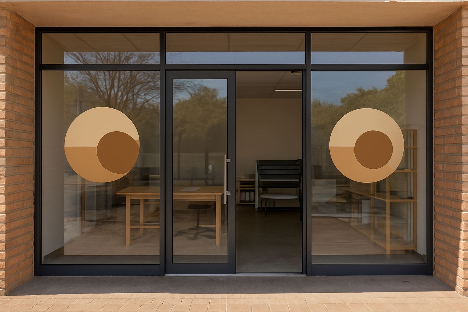
One of the biggest mistakes is covering too much glass. Full coverage can work on a back office, storeroom or meeting room, but on a shopfront it may block merchandise views and make the entrance feel closed off. Partial coverage is often the better answer, especially where you want a clean, open look.
Frosted film, solid colour vinyl and printed graphics each create a different feel. Frosted film gives privacy while still keeping light levels comfortable. Solid colour blocks can anchor a logo or message. Printed films work well for campaign messaging, seasonal promotions and directional graphics. We often mix finishes on one frontage so the result feels balanced rather than busy.
- Use frosted film where privacy matters more than high colour impact.
- Use solid logo panels to hold key branding points.
- Use printed panels for promotions, opening messages or wayfinding.
- Leave clear areas where visibility into the space still matters.
Use the glass as part of the building, not the whole story
Good branding on glass should work with the door frames, brick, cladding and signage outside. If every square metre carries artwork, the eye has nowhere to rest. A cleaner result often comes from using the glass for the most important information only, then supporting it with a fascia sign, entry marker or wall sign nearby.
That is useful for retail parks in Brits or along busy routes in Tshwane, where people are moving quickly and only have a few seconds to read the frontage. A logo near eye level, a line of service information and a modest band of frosting can be enough. It keeps the brand visible without making the frontage feel overworked. On municipal buildings the same approach helps with legibility and public access.
- Keep the main logo where it can be seen from normal approach distance.
- Use text sparingly, and only for the details people need most.
- Match the size of the graphics to the scale of the panes.
- Leave negative space so the building still reads properly.
Plan for sunlight, cleaning and everyday wear
Glass is exposed to strong sun, dust, frequent cleaning and, on some sites, coastal humidity carried inland on weather patterns. That means the material choice and the installation quality matter just as much as the artwork. If the site faces harsh afternoon sun, the wrong film can fade faster or start lifting at the edges. On busy entrances, repeated touching and cleaning can also shorten the life of a weak application.
We always look at exposure before recommending a finish. A glazed entrance in Akasia may need a different solution from a shaded internal divider in a corporate reception. For municipal sites, we also consider maintenance access and whether the graphic should be easy to update when departments or notices change.
- Check which side of the glass gets the harshest sun.
- Use finishes that can be cleaned without damaging the print or vinyl.
- Allow for frequent entrance use, especially on sliding or push-pull doors.
- Choose materials that suit long service in dust, heat and humidity.
Make entries safer and clearer with simple graphics
Glass doors and full-height panes can be a safety risk if they are too plain. A well-placed band, logo or contrasting marker helps people see the glass and reduces the chance of walking into it. That practical benefit is often overlooked when people think only about branding.
For clients with public access, such as clinics, municipal counters or showrooms in Pretoria and Hartbeespoort, it makes sense to combine identification with visibility. The same treatment can also mark entry and exit points, waiting areas or restricted staff zones. When done well, the result is neat, useful and easy to maintain. It is a small detail but it makes the space feel better organised, and safer too.
- Mark full-height glass at eye level so it is visible from both sides.
- Use contrasting colours where visibility is the main concern.
- Apply clear door markings for entry, exit and restricted areas.
- Keep public-facing messages short and easy to read at a glance.
A local example from Hartbeespoort to Pretoria
A retailer with a corner frontage between Hartbeespoort and Pretoria wanted more presence without losing the light inside the shop. The solution was not full coverage. We used a frosted lower band for privacy, a simple logo on the main panes and a small printed promotion near the door. The result gave the store a cleaner street view while still letting customers see into the space.
That kind of approach works well across Tshwane, Centurion and Brits, where many businesses share the same problem: they need to stand out, but they also need the building to feel open and accessible. For larger campaign rollouts, the same visual system can be repeated across several branches so the brand looks consistent from site to site. It saves time too, because the graphics can be planned for easy maintenance and future updates.
HM Graphics & Signs handles the process from site survey and artwork prep through to manufacture, installation and sign maintenance. That includes permit assistance where needed, which is useful for sites with municipal requirements or managed centres. A good glass brand is not about covering everything. It is about using the right amount of detail in the right place.
Keep the finish practical for the long run
Branding on glass should age well, not just look good on day one. If the artwork is too dense, too low, or set up without considering the building, it can date quickly and become a cleaning problem. A practical layout leaves room for changes, repairs and seasonal updates without replacing the entire frontage.
When the glass is treated with care, it becomes one of the most efficient branding surfaces on the property. It can welcome people, protect privacy, guide movement and support the wider identity of the site all at once. That is what makes it worth doing properly.
- Keep the layout simple enough to update later.
- Choose coverage that suits the site, not just the design idea.
- Balance branding with visibility, light and safety.
- Plan for maintenance from the start.