
Why Consistent Estate Signage Matters
In a residential estate, signs do more than point people in the right direction. They shape first impressions, help security teams work faster, and reduce the small confusions that turn into daily complaints. If the entrance sign looks one way, the directional boards another way and the rule notices like they belong to a different property, the whole estate starts to feel patchy.
Standardising entrance, directional and rules signage gives the estate one clear visual system. That means the same typeface, the same colours, the same mountings and the same tone of wording from the main gate to the last cul de sac. It also makes replacement easier when a sign is damaged by weather, vandalism or the wear that comes from sun, wind and dust. In Hartbeespoort and Pretoria, where estates face strong sun, summer storms and winter dust, that consistency helps signs last longer and stay readable.
Start With the Entrance Sign and Gate Identity
The entrance sign is the estate’s handshake. It is the first thing residents, contractors, delivery drivers and visitors notice before they even reach security. If this sign is faded, cluttered or too small for the road speed, the rest of the estate will feel less organised. A good entrance sign should be visible at a distance, sized for the approach speed and built from materials that can handle local conditions.
For estates near the N4 corridor, in Pretoria East or around Hartbeespoort, that usually means planning for strong UV exposure, rain and dust. Where there is coastal style humidity? no, but there is still moisture from irrigation, morning mist and storm water that can affect fixings and finishes. A proper gate sign system should also allow for reflective elements or clear illumination where needed, especially if the access road is busy or the entrance sits off a darker side road.
- Use one font family and one colour set across all estate signs.
- Keep the estate name, logo and estate rules aligned in size and placement.
- Choose materials that suit outdoor exposure, not just the first few months after installation.
- Plan for night visibility if the entrance is used after dark.
Directional Signs Should Make Movement Easy
Inside the estate, directional signs need to do a simple job well. Visitors should know where the visitor parking is, where to find the clubhouse, and which roads lead to phases, blocks or security points. The more signage styles you use, the more time people spend hesitating at turns. That creates traffic at gates and unnecessary calls to guards.
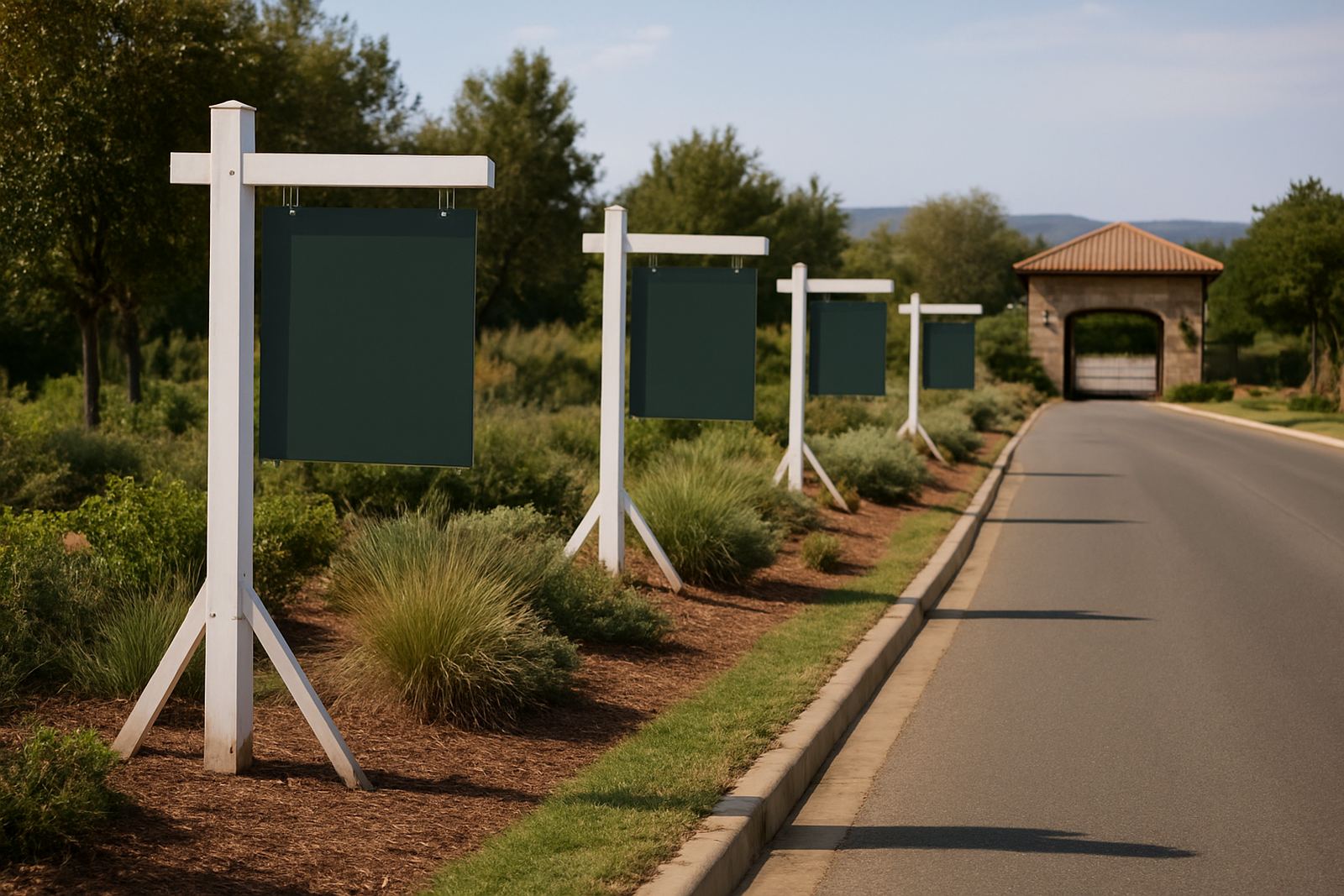
Good directional signage uses the same visual language as the entrance sign but stays practical. Arrows should be easy to read from a moving vehicle and the wording should be short. If a road changes name after phase development or a new area is added, the estate should update the full sign set instead of patching in a single mismatched board. It saves time later and keeps the estate looking controlled.
- Number roads or phases in a logical order.
- Use clear wording for visitor parking, refuse areas, amenities and service access.
- Match arrow style, board size and fixings across the estate.
- Replace damaged signs quickly so temporary labels do not become permanent.
Rules Boards Need Clear Wording and Calm Presentation
Estate rules signs are often crowded with too much information. When the text is squeezed onto a board that is too small, residents and visitors stop reading. Standardisation helps here too. If every rules board follows the same layout, people know where to look for access times, speed limits, pet rules, parking guidance and quiet hour information.
The wording should be direct and easy to read from a normal standing distance. A sign at the guardhouse can carry more detail than a sign near the sports area or pool gate, but both should still feel like part of the same system. This is where design and fabrication must work together. The board must be practical for day to day use, not just neat on paper. In estates with body corporate oversight, clear rules signage also helps reduce disputes because there is less room for confusion about what is displayed and where.
Use Materials and Finishes That Suit South African Conditions
In Gauteng and North West, signage gets hard use. The sun fades poor quality vinyl, dust settles into joins and rain tests every fixing point. In some estates, irrigation overspray and routine washing can also mark boards and supports. Standardising signage means the material choice can be planned once and repeated across the site, which helps with maintenance and future replacements.
For estate use, the sign family should be built with the same practical standard from start to finish. That may include aluminium composite, steel frames, reflective vinyl, powder coated supports and protective laminates where the board gets a lot of handling or weather exposure. The important part is not only what looks neat on the day of installation but what still reads well after a few seasons. One sign failing in full view of the gate can make the whole estate look neglected.
A Local Example From Hartbeespoort and Pretoria
We often see the difference consistency makes when an estate develops in stages. A Hartbeespoort estate may start with one entrance board, then add phase markers, contractor rules, speed limit signs and wayfinding to facilities as the development grows. If each item is ordered separately, the colours shift, the wording changes and the mounting heights differ. The estate ends up with a mixed message even when every individual sign was meant to solve one problem.
When the same visual standard is applied across the full site, the result is immediate. Visitors find the gate faster, residents know where to point contractors and security staff do not need to explain the same instructions over and over. In Pretoria and Centurion, where estates can have multiple entrances and mixed traffic flow, this also helps with permit control and site management. A coordinated sign set makes updates simpler when roads change or new sections open.
- Entrance sign updates should be matched with directional and rules boards.
- New phases should use the same fonts, colours and mounting heights.
- Security teams should review signs after each estate change so instructions stay current.
What to Ask Before You Approve New Signs
Before approving estate signs, committees and managing agents should ask a few practical questions. Will the signs be readable from the correct distance? Do they match the rest of the estate? Are they built for outdoor use? Can they be maintained or replaced without starting from scratch? If the answer to any of these is no, the estate is likely to spend more later on corrections.
A proper sign plan should begin with a site survey, then move through artwork prep, manufacture and installation in a controlled sequence. That is especially useful where estates need permit assistance, phased rollouts or several sign types at once. At HM Graphics & Signs, the work is managed from concept through to installation so the finished signs stay consistent across the full property. For an estate, that means fewer mismatched boards, fewer complaints and a clearer sense of order from the gate inward. It sounds small, but a good sign system changes how the whole place feels.