
What a post and panel sign is, and where it works best
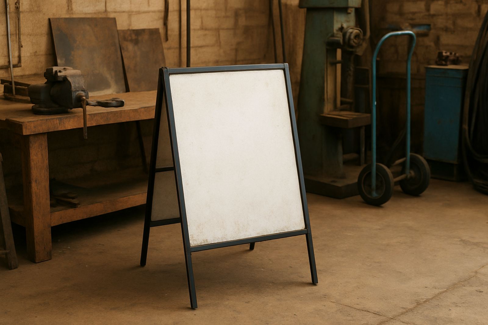
A post and panel sign is exactly what it sounds like: a display panel fixed between one or more vertical posts. It is used for site identification, tenant listing, directional messages and wayfinding at properties where drivers or visitors need to spot the message quickly. Because the sign sits above ground and can be scaled up, it works well for entrances, roadside sites, offices, schools, estates and light industrial yards.
In practical terms, this format suits sites that need visibility from moving traffic or from a gate set back from the road. In Pretoria and Tshwane, you often see these signs on business parks where access points are shared and the entrance must be clear in the first few seconds. A clean post and panel sign can do that job without clutter.
Choosing the right size, height and viewing angle
The first mistake many people make is choosing a sign that is too small for the road speed and setback. A driver passing at 60 km/h will not read the same amount of text as someone walking past on foot. The message needs to be short, bold and readable from the right distance. That means proper sizing, letter height and enough space around the wording.
- For close viewing, smaller panels can work with concise text and a logo.
- For roadside use, larger panels with fewer words are usually better.
- For multi-tenant sites, allow for clear hierarchy so the main name stands out first.
- For windy areas, avoid oversized panels without proper structural support.
Height also matters. A sign that is too low can disappear behind a boundary wall, hedge or parked bakkie. One that is too high may be hard to read from a vehicle if the angle is wrong. The best result comes from matching the sign to the sightline, not just the available space.
Materials that hold up in North West and Gauteng conditions
Post and panel signs live outdoors, so material choice has to match the site. In Hartbeespoort and parts of Pretoria, strong sun and dust are common. In some areas, humidity and heavy rain can also affect fixings and finishes. If the sign is close to the road, there is also grime from traffic that builds up over time. The right combination of face material, frame and post finish helps the sign last longer and stay legible.
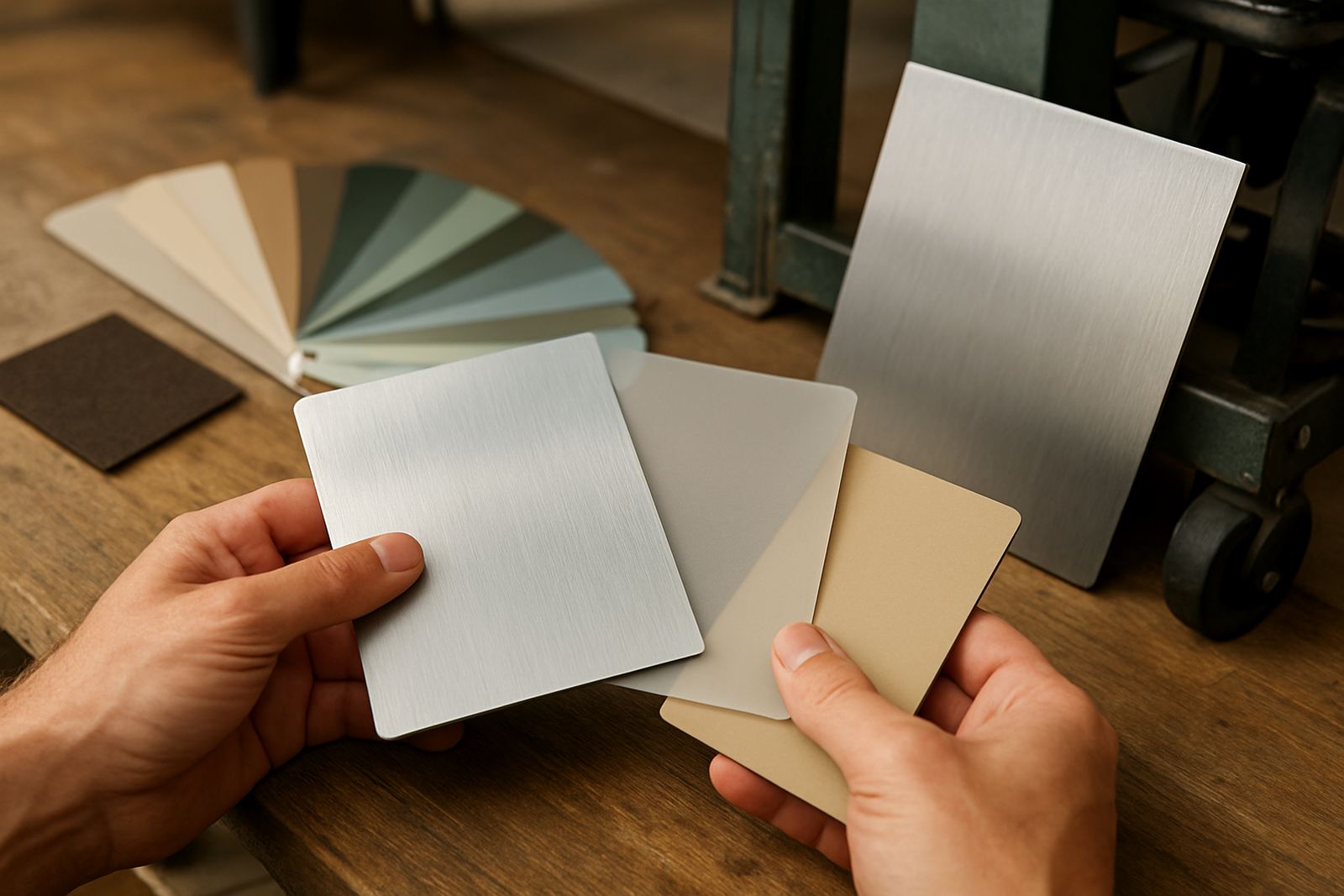
Common options include metal posts, powder coated frames, rigid panel boards and printed or cut vinyl graphics. For a cleaner corporate look, aluminium composite panel is often a solid choice. For temporary campaigns, lighter board systems can be more suitable. The important point is that the whole assembly must be designed as a unit, not as separate parts thrown together at the last minute.
- Metal posts give good support for larger signs.
- Powder coated finishes can help with weather resistance.
- Printed faces work well for branding and full colour graphics.
- Vinyl cut lettering is useful for sharp, simple messages.
Why site surveys and permit checks save time later
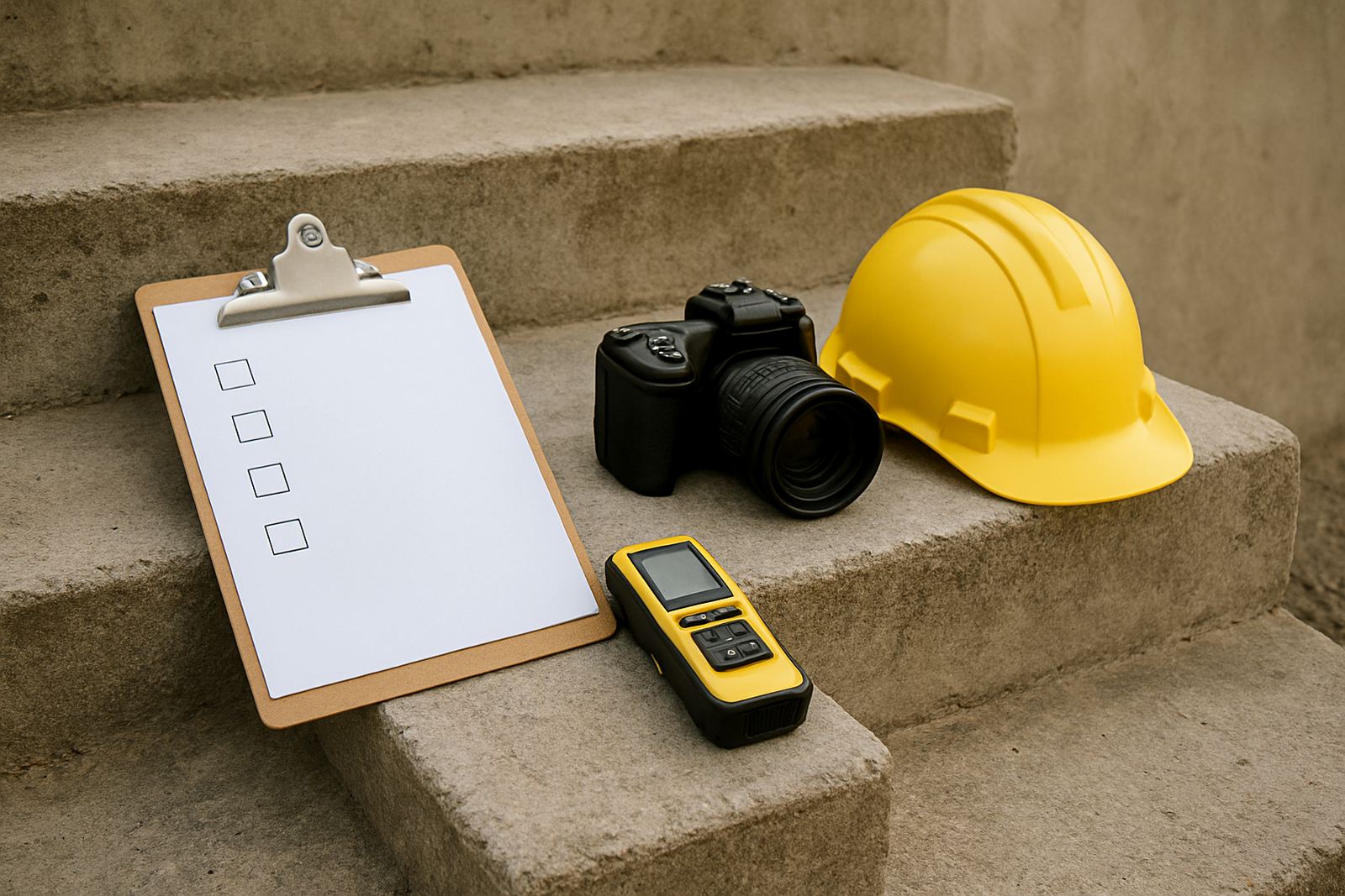
A proper site survey tells you more than just the width of the mounting area. It shows ground levels, underground services, boundary lines, nearby trees, access for installation and whether the sign will need extra support. On public-facing sites, it also helps establish whether the proposed size or position may need municipal approval. That matters in Tshwane and other busy metros where signage rules can affect height, setback and visibility from the road.
It is far easier to measure first than to discover later that a post position blocks a pavement, clashes with a wall or sits too close to a service line. For clients in Centurion, Akasia or Brits, a site visit can prevent costly changes during installation. It also gives the team a chance to plan crane access, ladder work or after-hours fitting where needed.
Design choices that make the message work harder
Good sign design is not only about making something attractive. It is about guiding the eye to the right information in the right order. For a post and panel sign, that usually means a clear main name, simple supporting text and strong contrast. If the sign includes wayfinding, the wording should be short and plain. Too much detail makes the sign hard to read and easy to ignore.
Colour contrast is especially important outdoors. Dark text on a light background, or light text on a dark background, usually gives better legibility than soft tones. Fonts should be clean and bold enough to hold up at distance. If a property needs multiple messages, consider grouping them into a simple layout rather than stacking too much information in one place. A cluttered panel often looks smaller than it really is.
- Keep the main message at the top or centre of the panel.
- Use one clear font family where possible.
- Leave breathing space around logos and text.
- Test the layout as if you are seeing it from a car, not from a screen.
Installation, maintenance and when to refurbish
Installation matters as much as fabrication. Posts need correct footing depth, straight alignment and secure fixing so the sign does not lean after the first strong wind. If the site is near a roadway or entrance with heavy vehicle movement, placement must also allow safe access for installers and for anyone entering the property later. A sign that is well made but badly fixed can become a maintenance problem very quickly.
Over time, panels can fade, graphics can lift at the edges and fixings can rust, especially where weather exposure is constant. Refurbishment is often a sensible option when the structure is still sound. In many cases, the posts can be kept and the face replaced, which saves time and money. For municipal sites and busy commercial properties, regular checks help keep the sign clean, straight and readable.
A local example: a clear entrance sign for a growing site
Picture a business property on the Pretoria side of the Hartbeespoort route, with deliveries arriving early and visitors missing the entrance because the name sits too close to the wall. A post and panel sign at the gate can solve that problem with one clear message, placed where traffic can see it before turning in. If the property also has several tenants, the same format can carry a simple directory or directional arrows without needing multiple separate signs.
That is why this format stays popular across Tshwane, Centurion and Brits. It is flexible, practical and easy to update when the tenant list changes or a campaign needs a fresh look. For many sites, it is the first sign people see and the one that does the heaviest work.