Why distance changes everything on a sign
Reading distance is the starting point for almost every sign brief. A shopper at a mall entrance has time to read a longer message than a driver moving past a roadside pylon at 60 km/h, and a municipal notice seen on foot can use smaller text than a shop front viewed across a parking area. If the distance is wrong, even a well made sign looks cluttered or too small.
As a rule, the further away the viewer is, the fewer words you should use and the bigger each letter must be. That applies to fascia signs, directional signs, estate boards, vehicle graphics and safety notices. In Gauteng traffic, people often have only a few seconds to take in a message so practical layout matters as much as colour and finish.
Simple letter height rules that work on site
A useful starting point is that 1 cm of letter height gives roughly 1 metre of comfortable reading distance for clear, simple wording. So a 10 cm high letter can be read at about 10 metres, while a 20 cm letter suits around 20 metres. This is a guide, not a strict law, because font style, contrast, mounting height and lighting all affect the result.
For South African sites with mixed traffic, these practical ranges usually help:
- Pedestrian signs, notices and internal wayfinding: 10 mm to 30 mm lettering
- Shop fronts viewed across a forecourt or parking area: 50 mm to 120 mm lettering
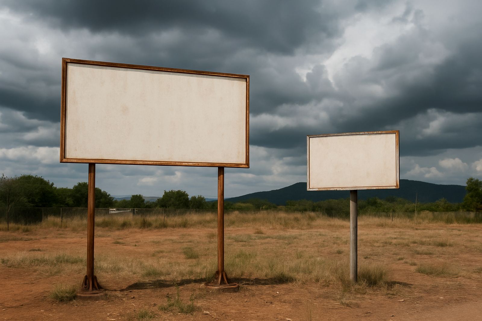
- Roadside and freestanding signs: 150 mm to 300 mm lettering or more
- Large municipal, industrial or approach signs: 300 mm plus, depending on speed and setback
If the wording is long, practicaly the best answer is often a second sign rather than squeezing everything onto one face.
Match the message to the real viewing speed
Distance is only part of the picture. A sign at a pedestrian crossing and a sign beside a busy arterial road face very different reading conditions. A slow walker can handle more words and smaller logos, while a passing motorist needs bold text, strong contrast and a short message. If the sign must be read while moving, the design should allow for quick recognition and not force the eye to search for the main point.
Use this as a practical guide:
- Walking pace: more detail is acceptable, but keep hierarchy clear
- Low speed vehicle areas: short phrases, large lettering, high contrast
- Fast traffic: one main message, minimal wording, few design elements
- Night viewing: reflectivity or external lighting becomes part of readability
Load-shedding also changes the brief. If a sign must still work during power cuts, you need reflective finishes, strong daylight contrast or non-electric identification that does not depend on illumination.
How layout and line breaks affect readability
People do not read signs word for word the way they read a letter. They scan for shape, colour blocks and key words first. That is why line breaks matter. A clean layout with a short top line, a clear middle line and a controlled bottom line is easier to read than one long sentence broken in awkward places.
Keep these layout points in mind:
- Use the most important word first, especially on directional signs
- Leave breathing room around the text so the face does not feel crowded
- Limit the number of fonts and styles on one sign
- Keep logos and supporting text secondary if the sign is meant for distance reading
For example, a retail centre sign in Centurion may need the tenant name to be legible from the driveway, while the suite number can be smaller because it is read at close range once the visitor has already arrived.
Local example from Pretoria and Hartbeespoort
Consider a retailer in Pretoria North with a frontage facing a main road and parking bays set back about 18 metres. The client may want the logo, shop name and trading hours all on one face. At that distance, the shop name should be the lead element, the logo should support it, and trading hours should move to a separate entrance sign or window graphic. If everything is made equal size, the eye has to work too hard and the message gets lost.
Now compare that with a municipal sign in Hartbeespoort at a site entrance where motorists slow down to turn. The sign can carry a slightly longer instruction, but the main heading still needs to be large enough to read before the vehicle reaches the gate. In both cases, a site survey helps determine the exact setback, angle and mounting height so the final size is right the first time.
Getting the size right before fabrication starts
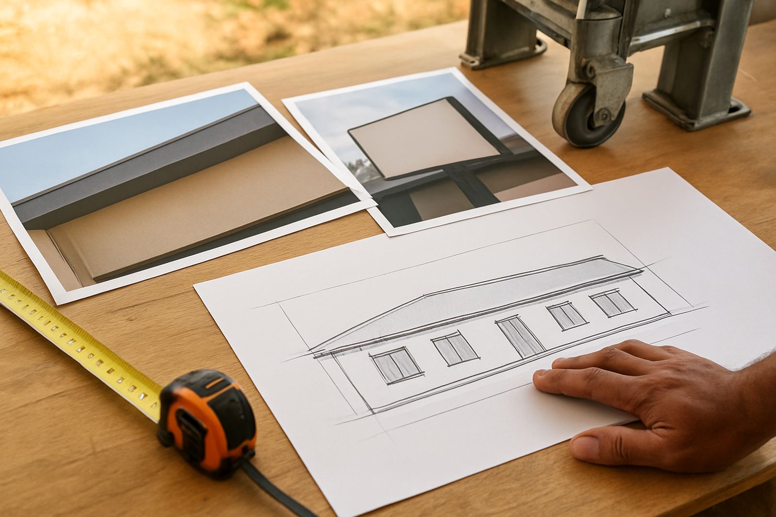
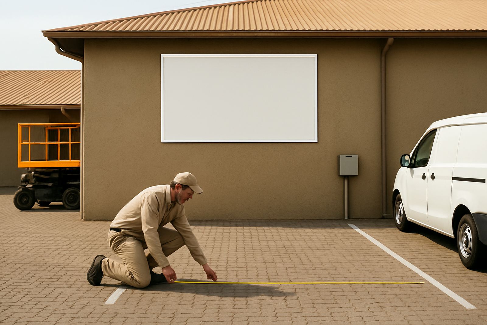
Good sign planning starts with measurement. We look at the viewing distance, the angle of approach, the height of the mounting surface and any obstructions such as trees, poles or parked vehicles. We also consider local conditions like dust, coastal humidity on longer delivery routes, sunlight glare and municipal rules for freestanding signs or street-facing installations.
Before production, it helps to confirm:
- Who must read the sign, from where and at what speed
- Whether the message is for first-time visitors or repeat users
- What time of day the sign must perform best
- Whether the sign needs permit assistance or site approval
Once the site details are pinned down, the sign spec is easier to get right. The right letter height, material choice and finish can be matched to the real viewing conditions, not guessed from a photo or a quick phone call.