
Start With the Job Your Reception Sign Must Do
Before you choose a finish or shape, decide what the sign must do in the room. Some reception areas need a strong brand marker behind the counter, while others need a practical wayfinding piece that directs visitors to security, accounts or waiting areas. In a municipal office, clinic, showroom or corporate foyer, the goal is not just to look good. It must help people orientate themselves quickly and feel confident they are in the right place.
Measure the viewing distance and note where visitors stand while they wait. A sign that looks neat up close can disappear from across a wide foyer. In Pretoria and Centurion, many reception spaces have hard floors, glass and bright daylight, so reflections can reduce legibility if the finish is too shiny. In smaller Hartbeespoort premises, the sign may need to work in a tighter wall space with less room for a large logo panel.
- Define the main role: branding, direction, compliance, or all three.
- Check the main viewing distance from the entry point and reception counter.
- Note glare from windows, skylights and polished floors.
- Allow space for cleaning access and future changes to office names or departments.
Choose Materials That Suit the Room and the Climate
Interior signs are often judged by colour and shape, but the material matters just as much. In Gauteng, indoor spaces still face dust, dry air and strong light through glass, while Hartbeespoort and other areas near water can bring extra humidity into lobbies with open doors. The right board, acrylic or metal finish will hold colour better and stay neat for longer.
For a reception feature, we usually consider rigid panels, raised lettering, cut vinyl, illuminated letters or layered combinations. Acrylic gives a clean modern look and can be used with backers for depth. Brushed metal works well in formal spaces, while painted panels suit larger walls and stricter budgets. If your building has load-shedding or limited backup power, choose a sign that still reads well without lighting. That way the brand remains visible during outages and after hours.
- Acrylic for a crisp corporate look and easy cleaning.
- Metal or brushed finishes for a more formal, durable feel.
- Foam board or layered panels where weight on the wall must be kept low.
- Vinyl graphics for shorter-term campaigns or when branding may change often.
Match Size, Lettering and Colour to the Wall
Reception signs fail most often because they are too small, too busy, or placed too high. A good rule is to keep the layout simple and let the logo breathe. If the wall behind the reception counter is textured, dark or busy with doors and frames, the sign needs stronger contrast. If the wall is plain and light, a more subtle treatment can work well.
Letter height should suit the room size. In a long foyer with a high ceiling, thin script and tiny text will disappear. In a compact office in Akasia or Soshanguve, oversized shapes can overwhelm the wall and make the counter feel cramped. Use one or two brand colours where possible, then add a neutral base so the sign remains clear in natural and artificial light.
- Keep secondary text short, such as a division name or slogan only if it adds value.
- Test the design from 5 metres, then again from the entry point.
- Use contrast, not just colour, to improve legibility.
- Avoid clutter near the sign such as notices, posters or loose cabling.
Plan the Installation Before the Artwork Is Finalised
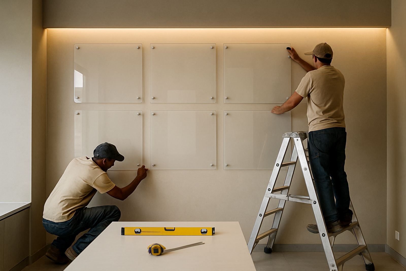
Good reception signage starts with a site survey. Wall condition, fixing points, available power, ceiling height and nearby doors all affect the final result. A tiled wall, plastered partition or glass screen each needs a different fixing method. If the sign is going into a public-facing municipal space, there may also be building rules, access hours or permit requirements that need to be checked before work starts.
It helps to plan the installation route early, especially if the sign is large or involves lighting. Production and fitting teams need to know whether the space allows after-hours installation, whether lifts or ladders can be used, and whether there is safe access without disrupting visitors. In busy Pretoria offices, a short installation window can make the difference between a clean handover and a rushed job.
- Confirm wall material and any hidden services behind it.
- Check if lighting is required and where power can be supplied.
- Agree on installation timing to avoid peak visitor hours.
- Ask whether municipal or landlord approval is needed before fabrication.
Use the Right Finish for Maintenance and Cleanliness
A reception sign should stay neat with minimal effort. Finger marks, dust and cleaning chemicals all affect how the sign ages. Matte and satin finishes can hide marks better than highly polished surfaces, while sealed edges help stop moisture getting into the panel. In coastal humidity or dusty roadside settings, a finish that wipes clean easily will save time and keep the area looking professional.
Think about who will clean the space and how often. If the sign sits behind a busy counter, staff may only have a few minutes to wipe it down. Raised letters should be fixed securely, and deep grooves should be avoided where dust can collect. For businesses with regular campaigns or changing departments, sign maintenance and refurbishment should also be part of the decision, not something added later.
Reception Sign Checklist Before You Approve the Order
Use this checklist before artwork is signed off. It will help avoid delays, rework and extra costs once fabrication starts. A few minutes of checking can save days later, especially if the sign is going into a branch rollout across Tshwane, Brits or Centurion where consistency matters across more than one site.
- Is the correct company name, division and logo version approved?
- Are the measurements taken from the actual wall, not from a drawing only?
- Has the material been chosen for the room conditions and cleaning routine?
- Does the layout still read clearly from the entry point?
- Has the installation date been matched to the site access rules?
- Are there any permit, landlord or municipal approvals still outstanding?
If the answer to any of these is no, pause and sort it out before production. A reception sign is a long-term feature, and small mistakes in spelling, spacing or size are expensive to fix once it is mounted.
When to Ask for a Professional Site Survey
If your reception area has uneven walls, glass partitions, high ceilings or a tight turnaround, a site survey is worth it. It helps confirm the best position, the fixing method and the most suitable finish before manufacture begins. This is especially useful for rollouts across multiple branches, where one office may have a plaster wall and another may need a suspended or lighted solution.
For businesses in Hartbeespoort, Pretoria, Centurion, Brits and surrounding areas, the best reception signs are usually the ones planned with the room in mind rather than copied from a catalogue. A careful survey, clear artwork prep and proper installation give you a cleaner result and less maintenance later, which is exactly what a busy front office needs.