
Start With The Site, Not The Sign
The right sign type depends on what you want people to read and how much detail must fit in. A clean box sign or flat panel works well for a simple logo and business name. Channel letters suit a premium look and stand out well on larger façades. Built-up lettering, aluminium panels, acrylic face signs, vinyl graphics and window branding each have a place depending on the site and budget.
If your frontage changes often, or you run campaigns and seasonal promotions, plan for signage that can be updated without replacing the whole face. For municipalities and busy retail sites, the message often needs to be clear from a distance and easy to maintain. Lightbox signs are useful where evening visibility matters, while non-illuminated signs can be enough for shaded or indoor-facing entrances.
- Simple name and logo: flat panel, acrylic, cut vinyl or box sign.
- High visibility at night: internally lit or externally lit frontage sign.
- Frequent campaign changes: modular panels or vinyl overlays.
- Premium finish: built-up lettering or layered materials.
Match Materials To Weather, Use And Maintenance
Material choice affects how long the sign lasts and how often it needs attention. In coastal or high-humidity conditions, untreated steel can rust and printed faces can lift if the prep is poor. In strong sun, low-grade vinyl can fade early. For busy retail sites and roadside locations, you want a finish that holds shape, stays legible and can be cleaned without damage.
We normally look at the intended life span first. A short-term promotion may only need a few months of service, while a permanent shopfront sign should handle years of sun, rain and dust. Aluminium is popular because it resists corrosion and stays light enough for safe fixing. Acrylic gives a neat finish for faces and illuminated signs, while quality vinyl is ideal for graphics, lettering and window applications. On load-shedding sensitive sites, a sign that does not rely on lighting is still worth considering as the main day-time identifier.
- Permanent frontage: aluminium, acrylic, powder-coated metal or durable composite panels.
- Short-term promotion: printed vinyl, temporary boards or removable graphics.
- Coastal or humid areas: corrosion-resistant fixings and sealed edges.
- High-traffic sites: materials that can take knocks and regular cleaning.
Get The Size, Layout And Readability Right
A sign can be well made and still fail if the layout is cramped. The best frontage signs are easy to read at a glance. Keep the wording short, use enough letter height for the viewing distance, and avoid squeezing too many details onto one face. If your business name is long, the layout may need to prioritise the name first and move the rest to windows, door vinyl or a secondary sign.
Colour contrast matters as much as size. Dark text on a light background or light text on a dark background usually reads better than soft tones with low contrast. At busy intersections around Pretoria, Akasia and Rosslyn, a clear contrast helps drivers recognise the sign quickly. We also check how the sign reads in daylight and at night, especially where nearby streetlights or headlights create glare.
- Keep the core message to the business name, logo and one short descriptor.
- Use large lettering where the sign must be read from moving traffic.
- Leave breathing space around the logo and text.
- Choose colours that stand out against the building finish.
Check Permissions Before Fabrication Begins
Some shopfront signs are straightforward, while others need approval before installation. This depends on the site, the municipality and the building owner or body corporate rules. In Gauteng, township, retail and commercial sites can all have different requirements. If a sign sits near a public road, crosses a boundary line, or includes lighting, permits may be needed. Municipal rules can also affect size, projection, illumination and placement.
It is better to sort this out early than to finish a sign and then be told it cannot go up. For brand rollouts and multi-site work, permit checks should form part of the plan from the start. That includes looking at the landlord agreement, tenant handbook and any local signage by-laws. A small delay at the front end is better than having to strip and remake a sign later.
- Confirm landlord or body corporate approval in writing.
- Check municipal requirements for illuminated or projecting signs.
- Review any restrictions on height, size and face position.
- Keep a record of drawings, dimensions and site photos for approval.
Plan Installation, Access And Ongoing Care
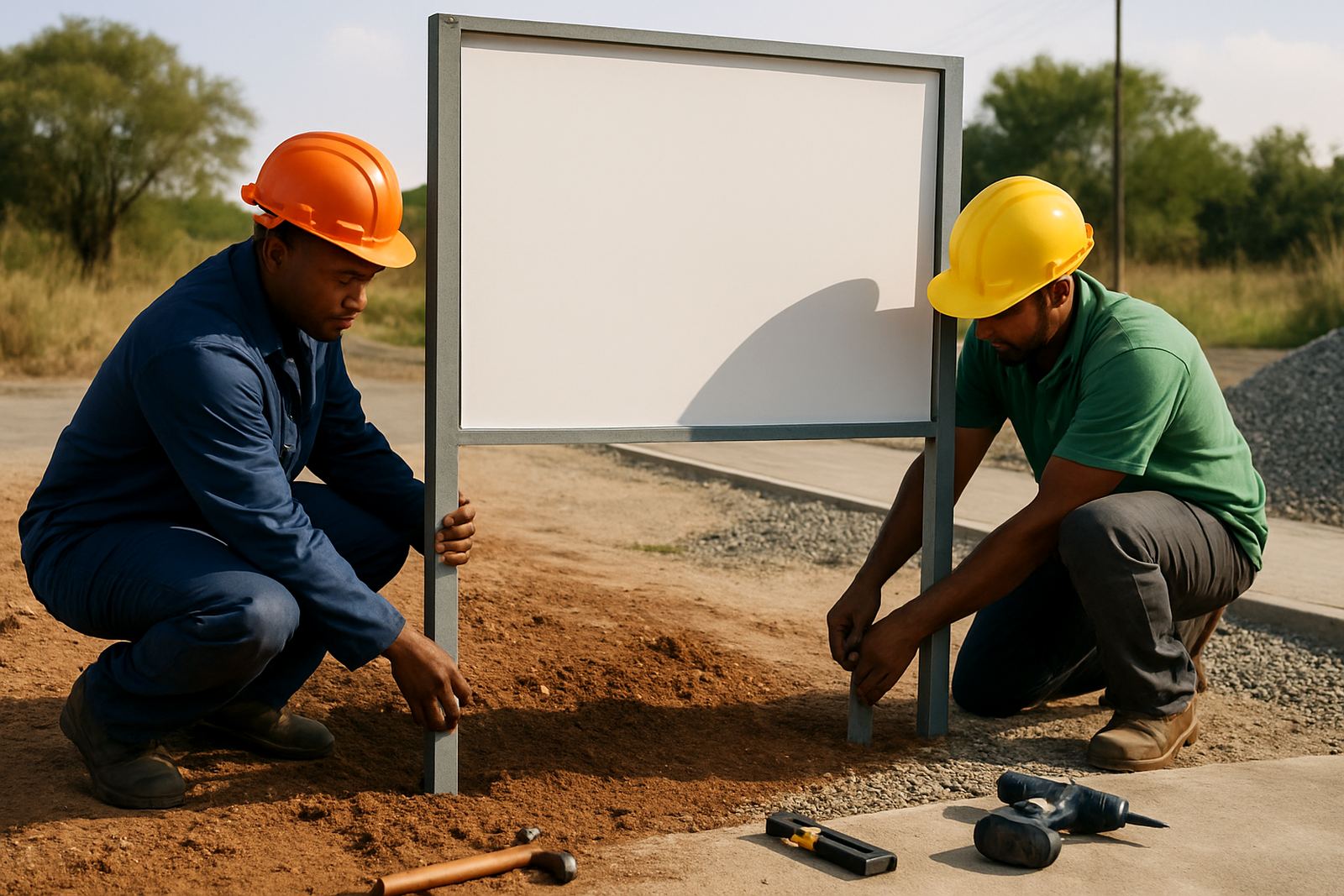
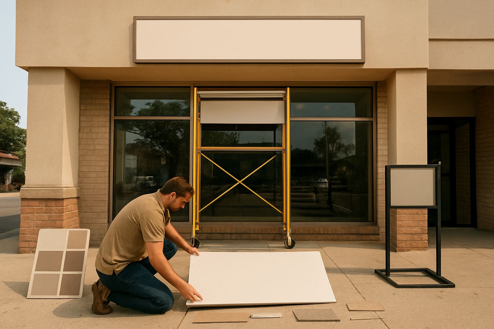
Installation is not just the last step, it affects the sign choice as well. A large fascia sign may need scaffolding, a cherry picker or after-hours access if the site is busy. On retail parks and municipal sites, installer safety and public access matter. The fixing method must suit the wall type, the weight of the sign and any wind exposure. If the site is exposed, anchors and supports need to be specified properly.
Once the sign is up, basic care keeps it looking sharp. Wipe dust off with a soft cloth, check for loose fixings after heavy wind and inspect lighting if the sign is lit. Refurbishment is often more economical than replacing the whole frontage. That can include new faces, fresh vinyl, repainting, replacement lamps or a full rebrand when the business changes direction. If you manage several sites across Tshwane, Brits and Centurion, a planned maintenance schedule helps keep every frontage consistent.
- Ask how the sign will be fixed and who is responsible for access.
- Check whether maintenance can be done without removing the whole unit.
- Plan for cleaning, repainting and face replacement over time.
- For rollouts, use the same sizes, colours and placement rules across all branches.